Lusso Modular
The longest document in the portfolio, and the most rigid system in it.

Case study · 37-page document
A brand standards manual structured like a specification, not a brochure.
This is a walkthrough of the delivered document, not a commissioned case study. We are not publishing a brief history, client interviews or performance figures for this project, because we do not have them. Everything described below is visible in the pages shown beside it.
The contents page is set out in decimal notation — 1.0 Brand Values through 9.0 Visual Identity, each with numbered sub-sections underneath. The practical effect is that a page can be cited in an email as “2.3” rather than described, which is the difference between a manual people use and one they scroll past.
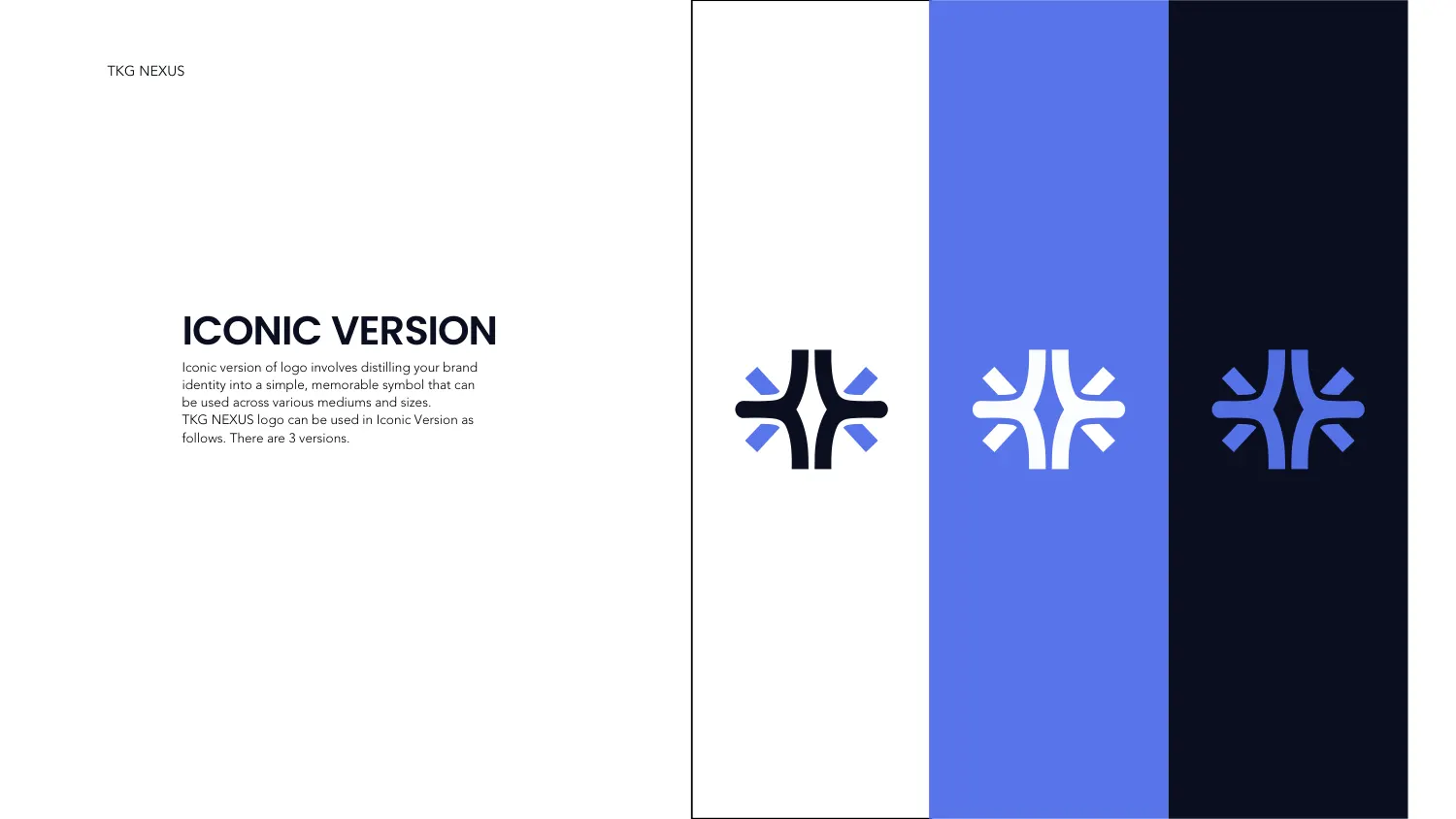
The mark is built on a vertical spine that pinches at the waist and flares top and bottom, with four angled darts set into the gaps either side. It reads as convergence — lines meeting at a centre — and it is drawn tightly enough to survive at icon size. Section 2 gives it four forms — the main lockup, a horizontal version, an iconic version and a black-and-white version — plus its own pages for logo spacing and logo usage.
The iconic version page shows the symbol alone in three colourways on three grounds — near-black on white, white on electric blue, and blue on near-black — side by side as vertical panels, so the contrast of each is judged against the others rather than in isolation.
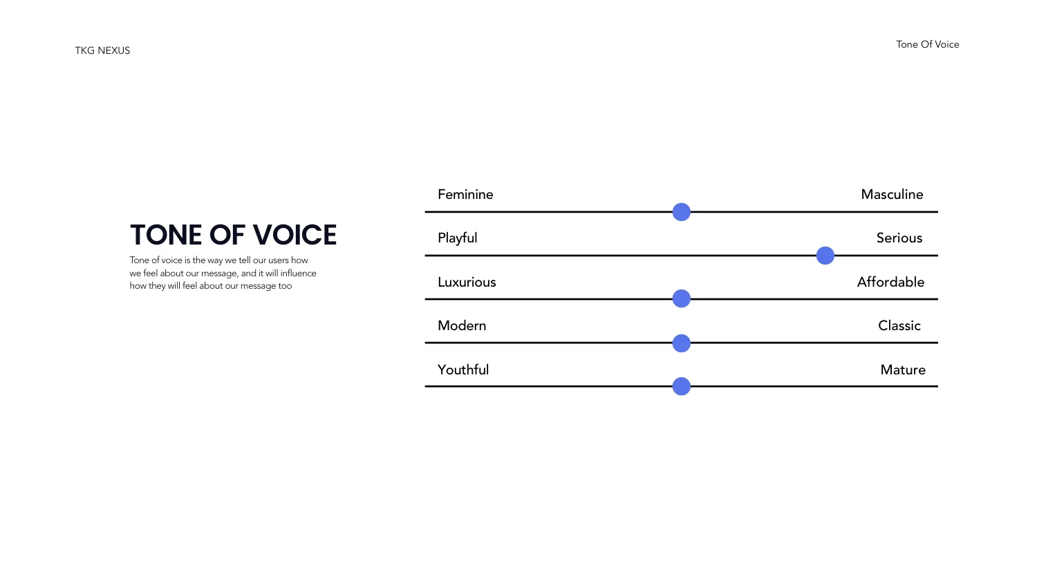
Section 1.3 is the page most guideline documents skip or fill with adjectives. Here it is five sliders, each with a marker placed on it: Feminine to Masculine, Playful to Serious, Luxurious to Affordable, Modern to Classic, Youthful to Mature. The markers sit near-centre on four of the five and well toward Serious on the second. The value of the format is that it is falsifiable — a writer can hold a draft against it and tell whether the copy is drifting.
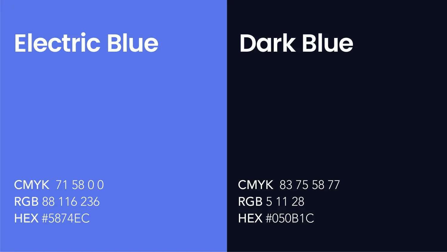
The main colours are Electric Blue #5874EC (CMYK 71 58 0 0, RGB 88 116 236) and Dark Blue #050B1C (CMYK 83 75 58 77, RGB 5 11 28) — a saturated blue against something close enough to black to act as ink. Section 4.2 then adds a pastel range for the situations the two-colour system cannot cover: #7990F0 and #9CACF4 as lighter blues, #3B404D and #696D77 as cool greys.
Typography runs as a primary and secondary pair, with Poppins Regular named as the secondary face carrying body text, and a separate typography-style page fixing how the two are used together.
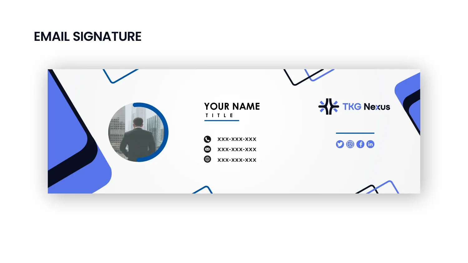
Sections 7 to 9 are all application. A stationery mockup and a business card mockup, then an email signature built as a real template with a portrait crop, a contact block, the logo and social icons laid into the brand’s angular shapes. Section 8 supplies three social media posts. Section 9 closes on outdoor: a hanging banner and a billboard.
Between them, section 5 sets out the icon set and section 6 fixes the brand mood for imagery — so the two things a team will improvise fastest, icons and photography, are the two the document pins down before it ends.
All 37 pages are readable in full on the work page, alongside the 11 guideline documents and 47 logo projects in the rest of the portfolio. If you want a document like this one, the brand guidelines service explains what goes into it and the process page explains how a project runs — first draft in 24–36 hours.
Prefer to order through Fiverr? The same work is available on the logo and brand identity gig, where the 2,604 reviews behind the 4.9 rating are public. Briefing here is identical either way — and the copyright assignment is included on both.
Send the brief and we will come back with questions, a timeline and a quote — no charge for the conversation.
Start your project