Lusso Modular
The longest document in the portfolio, and the most rigid system in it.

Case study · 15-page document
The shortest of the nine, and the most disciplined about tints.
This is a walkthrough of the delivered document, not a commissioned case study. We are not publishing a brief history, client interviews or performance figures for this project, because we do not have them. Everything described below is visible in the pages shown beside it.
Fifteen pages, numbered sections, a thin red rule under every heading. Section 6 is the palette, section 8 the secondary typeface, section 11 the social applications. Here is what those specify.
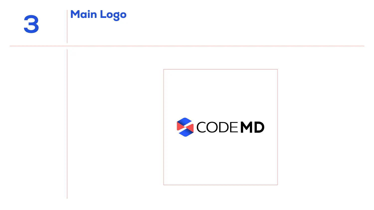
The mark is an isometric hexagon built from blue and red facets — flat shapes arranged so the eye assembles them into a cube seen corner-on. It sits left of the wordmark, which splits CODE in a light weight from MD in a bold one. The name carries its own emphasis; no colon, no space, no second colour needed to separate the two halves.
Weight-splitting a compound name is the cheapest possible way to make it parse correctly, and it survives everything — one colour, embroidery, a favicon. A colour split would have failed the first time someone printed it in black.
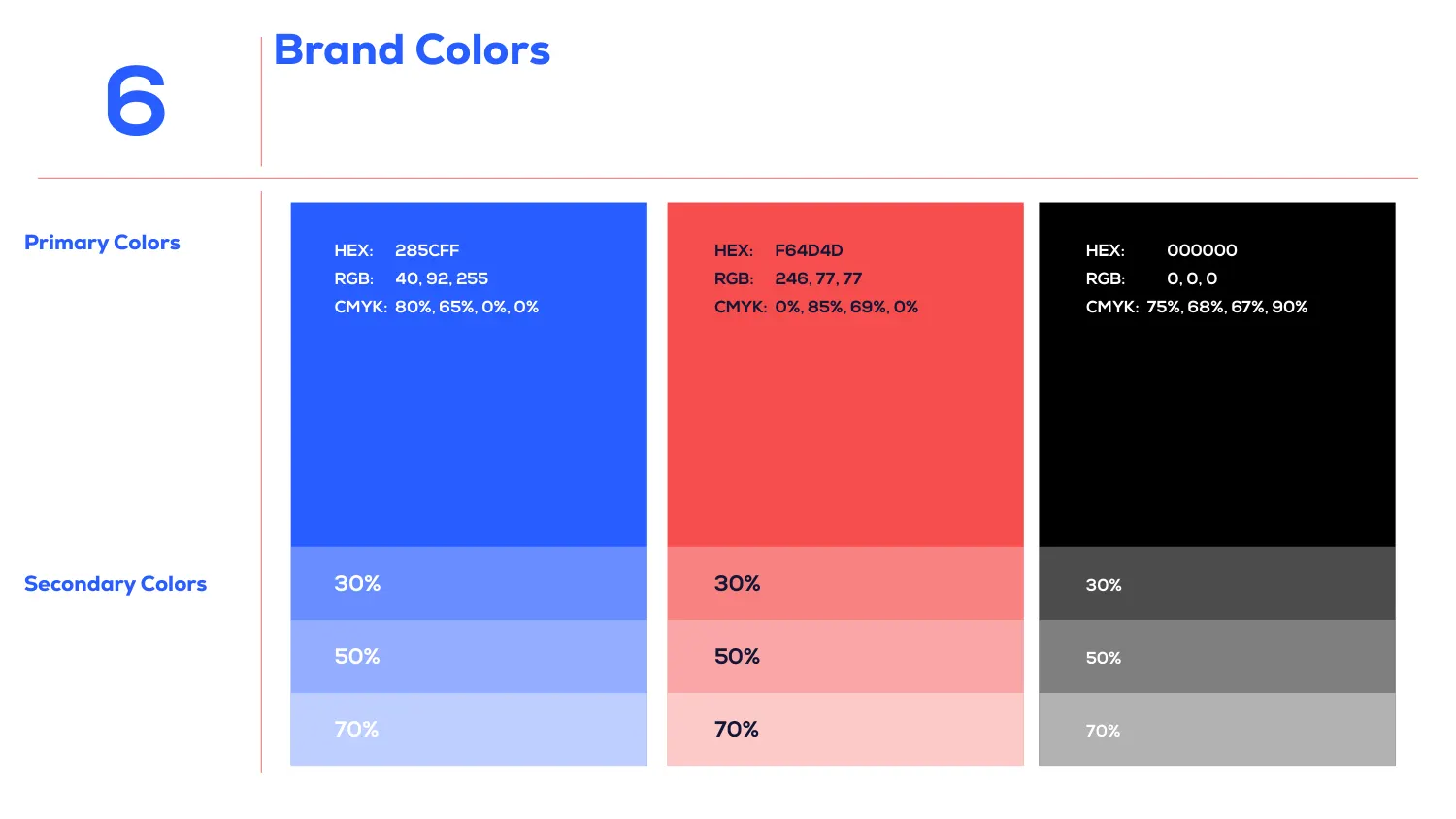
The palette is Blue #285CFF (RGB 40, 92, 255 · CMYK 80, 65, 0, 0), Red #F64D4D (RGB 246, 77, 77 · CMYK 0, 85, 69, 0) and Black #000000. Each is given in all three notations on the swatch itself.
Underneath each primary the page fixes the secondary range at exactly 30%, 50% and 70%. That is the detail worth copying: an unbounded instruction to “use lighter tints” produces a different blue in every deck anyone builds. Three named steps produce the same three blues forever, and they are printed here as swatches rather than described.
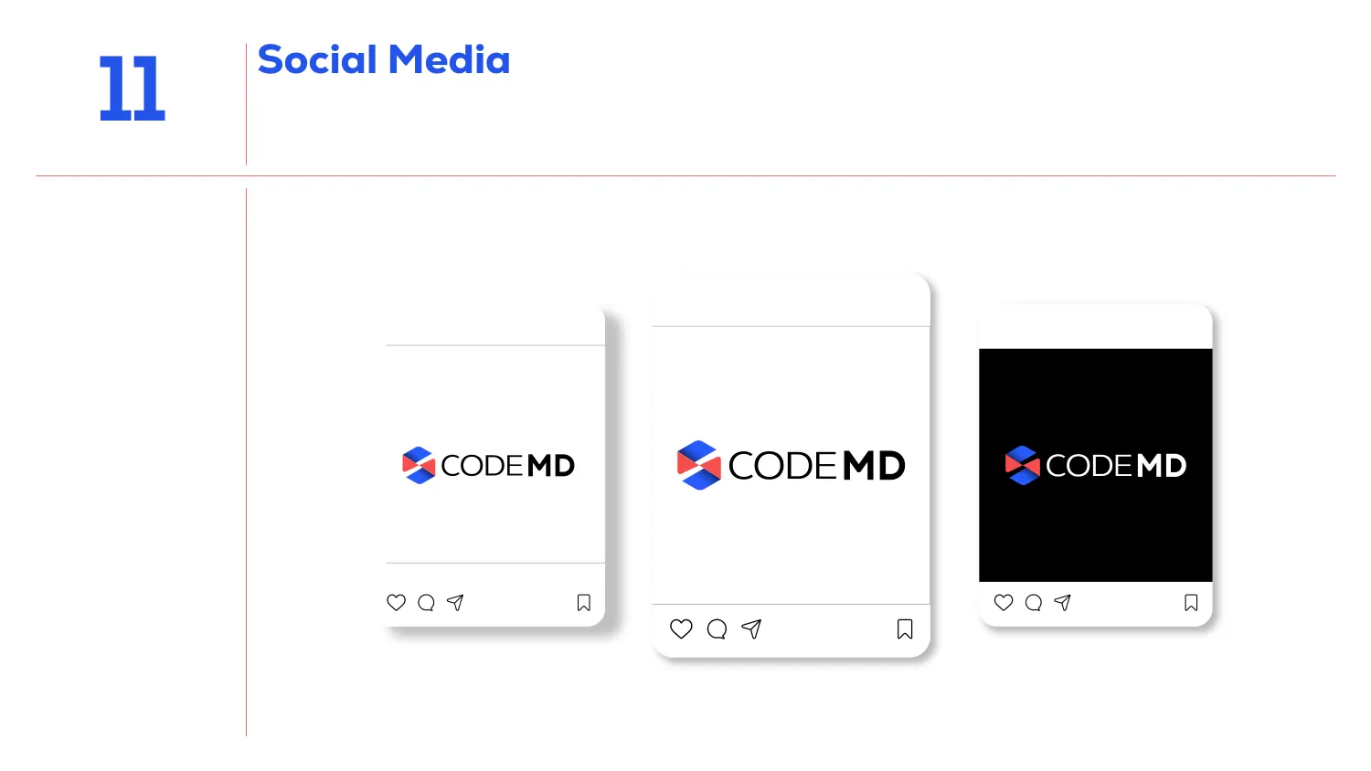
The social page mocks the identity into three post frames — two on white, one where the image area is solid black with the logo reversed out. The wordmark switches to white; the hexagon keeps its blue and red.
Showing the dark case in the applications section, rather than leaving it to a contrast rule twenty pages earlier, is what stops the question being asked later. Somebody will post on a black background in the first week. The document has already answered it.
All 15 pages are readable in full on the work page, alongside the 11 guideline documents and 47 logo projects in the rest of the portfolio. If you want a document like this one, the brand guidelines service explains what goes into it and the process page explains how a project runs — first draft in 24–36 hours.
Prefer to order through Fiverr? The same work is available on the logo and brand identity gig, where the 2,604 reviews behind the 4.9 rating are public. Briefing here is identical either way — and the copyright assignment is included on both.
Send the brief and we will come back with questions, a timeline and a quote — no charge for the conversation.
Start your project