Lusso Modular
The longest document in the portfolio, and the most rigid system in it.

Case study · 39-page document
A master brand and two sub-brands, resolved inside one document.
This is a walkthrough of the delivered document, not a commissioned case study. We are not publishing a brief history, client interviews or performance figures for this project, because we do not have them. Everything described below is visible in the pages shown beside it.
The contents page numbers six sections and prints the page range of each: Brand 03–07, Logo 08–13, Sub Brands 14–26, Typography 27–30, Colors 31–33, Brand Assets 34–38. Thirteen of the thirty-nine pages go to sub-brands, which is where most of the document’s length went.
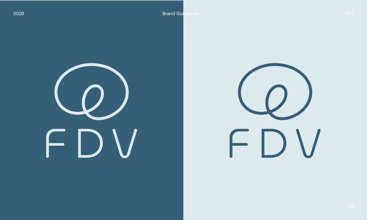
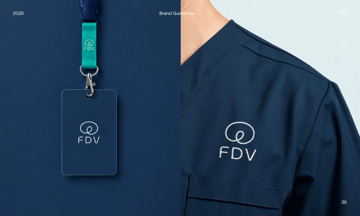
The symbol is drawn as a single unbroken stroke: a wide outer loop that crosses back through itself into a smaller inner loop, ending without a visible join. It sits above FDV, set in a light rounded-geometric sans with open terminals and a wide-splayed V. Stroke weight in the letterforms matches the weight of the loop, so the mark and the name read as one drawing rather than a symbol placed on top of a wordmark.
The document shows it in both directions — pale on the deep blue, deep blue on the pale tint — across a split spread, which is a more useful test than a single positive version. A clear-space page sets an 80px exclusion on all four sides, measured off the lockup rather than off an arbitrary bounding box.
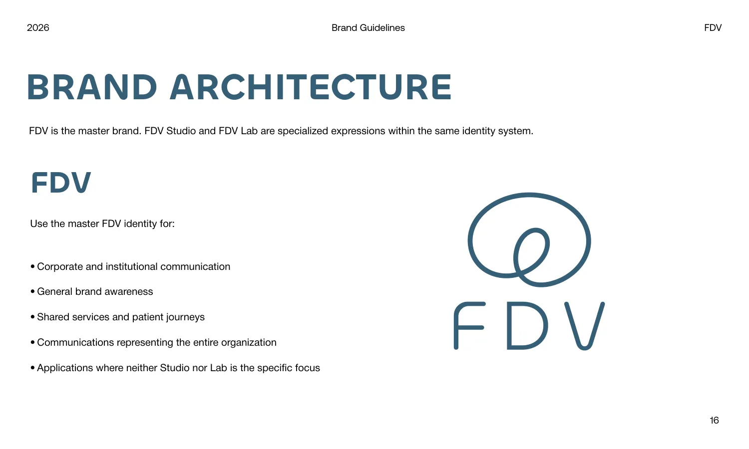
The brand architecture page states the structure plainly: FDV is the master brand, and FDV Studio and FDV Lab are specialised expressions within the same identity system. It then lists in bullets exactly when the master identity is the correct one to reach for — corporate communication, general brand awareness, shared services and patient journeys, and any application where neither Studio nor Lab is the focus.
The sub-brand lockups keep the loop and change one variable. FDV Lab renders it in lime green with “lab” set beneath the letters in the same green, while FDV stays steel blue. That is the entire differentiation — no second symbol, no second typeface — which is why all three can sit on one page without competing.
One typeface carries the whole system. Chillax is shown in Bold, Semibold and Regular with full uppercase, lowercase and numerals, and the specimen page demonstrates the hierarchy in situ rather than as an abstract scale.
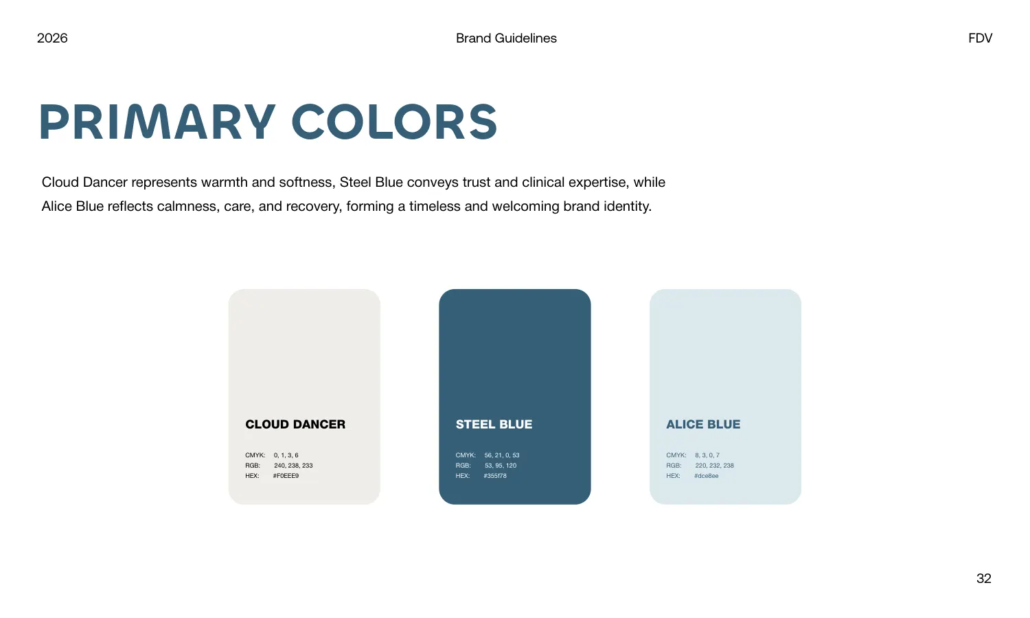
The palette runs to three: Cloud Dancer #F0EEE9, Steel Blue #355f78 and Alice Blue #dce8ee, each with CMYK and RGB printed beside the hex. The palette page also writes a line on what each colour is meant to convey, so the reasoning survives a handover.
The asset pages show where this identity has to work, and it is not on a poster. There is a lanyard and ID badge, and the mark embroidered onto clinical scrubs — an application a single-weight continuous line is well suited to, because there is no fine detail in it to fill in when it is stitched.
Every page carries the same running header, 2026 / Brand Guidelines / FDV, with a numbered folio bottom-right.
All 39 pages are readable in full on the work page, alongside the 11 guideline documents and 47 logo projects in the rest of the portfolio. If you want a document like this one, the brand guidelines service explains what goes into it and the process page explains how a project runs — first draft in 24–36 hours.
Prefer to order through Fiverr? The same work is available on the logo and brand identity gig, where the 2,604 reviews behind the 4.9 rating are public. Briefing here is identical either way — and the copyright assignment is included on both.
Send the brief and we will come back with questions, a timeline and a quote — no charge for the conversation.
Start your project