Lusso Modular
The longest document in the portfolio, and the most rigid system in it.

Case study · 36-page document
A lettermark that draws the name, and a palette with proportions attached.
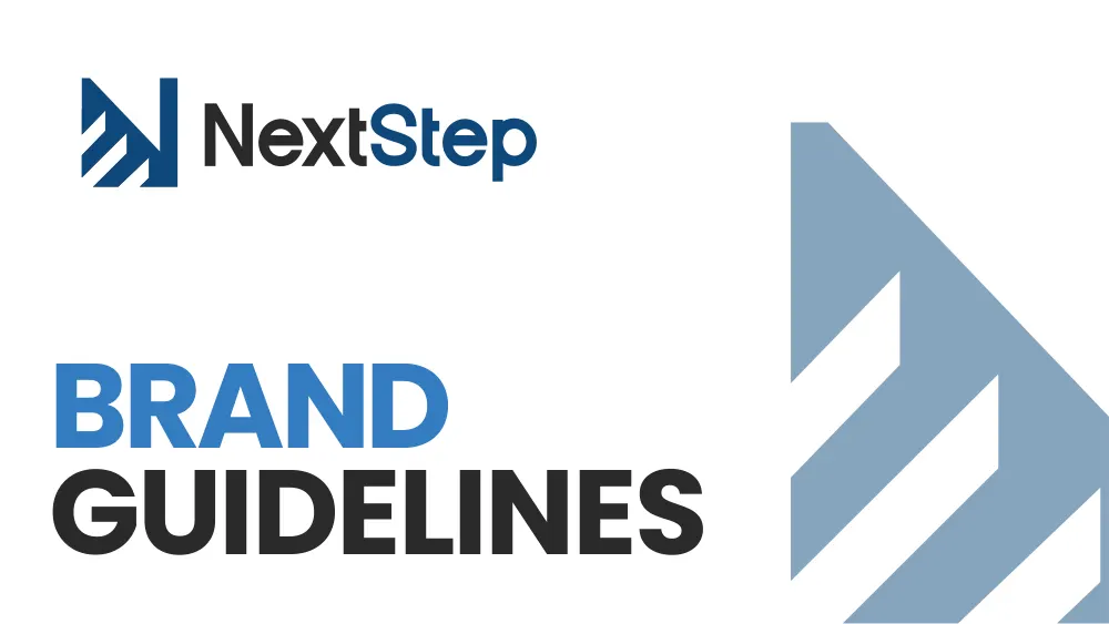
This is a walkthrough of the delivered document, not a commissioned case study. We are not publishing a brief history, client interviews or performance figures for this project, because we do not have them. Everything described below is visible in the pages shown beside it.
Thirty-six pages, and the spine of it is a lettermark that says the name rather than abbreviating it. What follows is what the document specifies and what it shows.
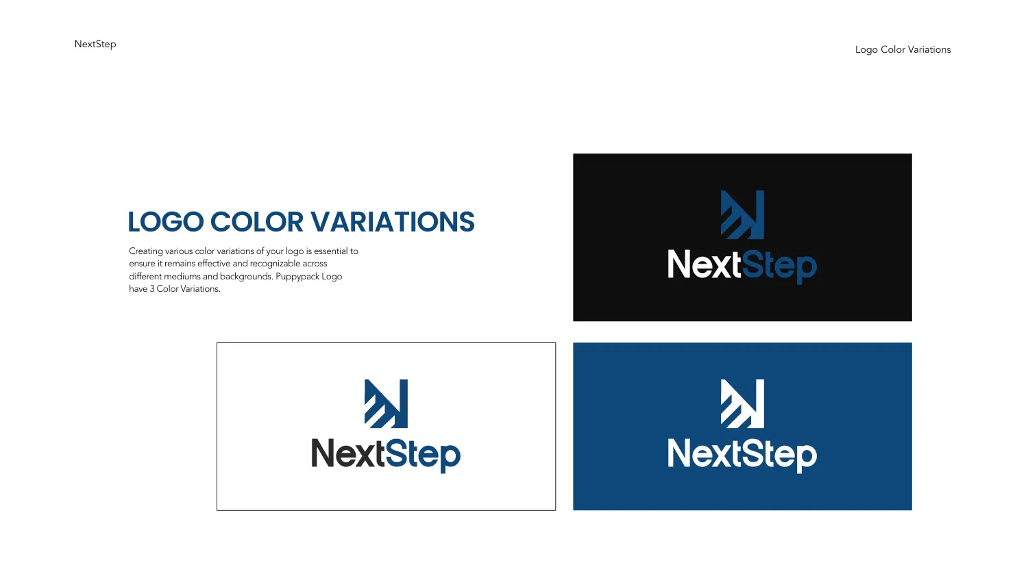
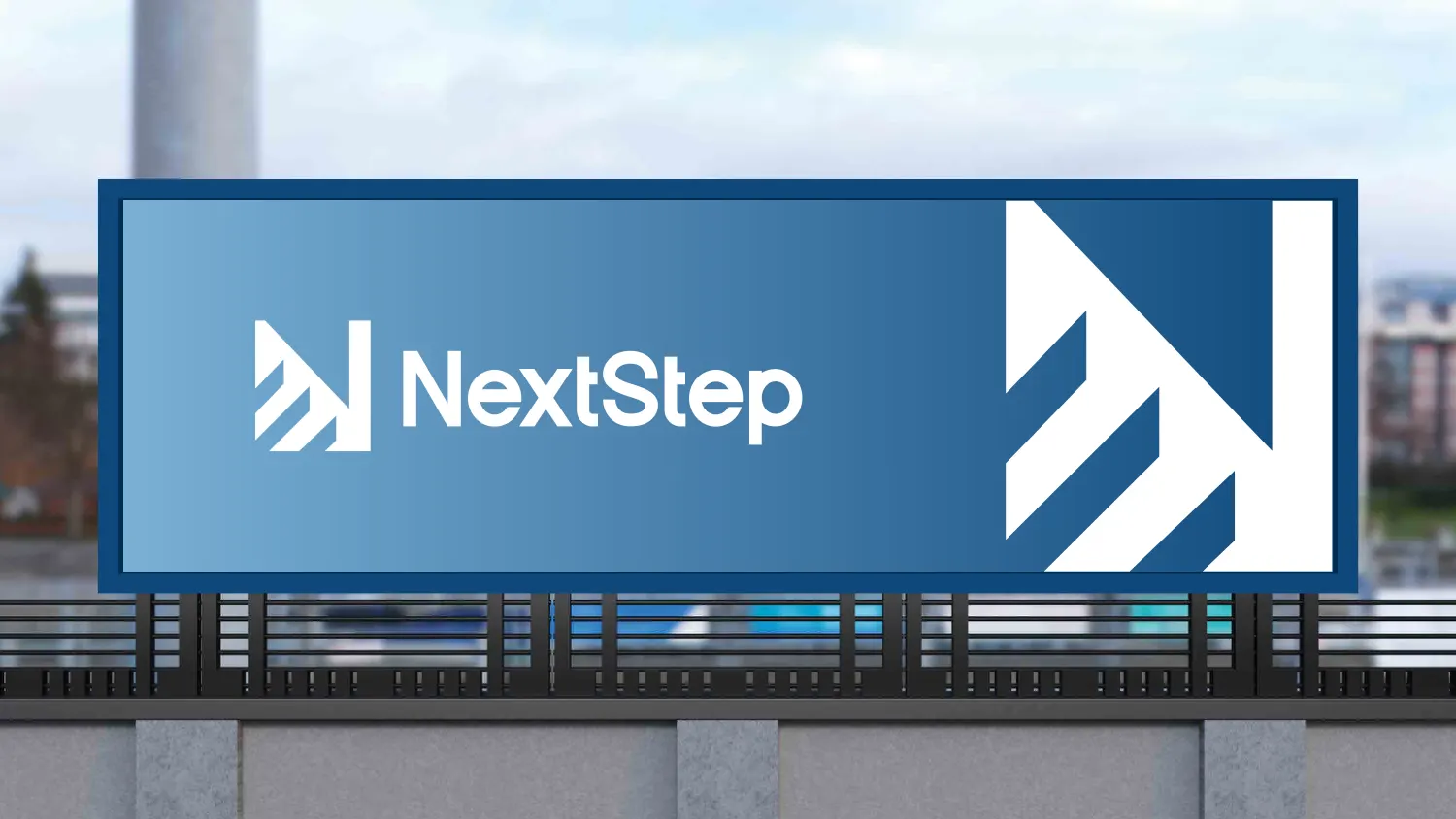
The symbol is a capital N assembled from a solid vertical bar on the right and a run of stepped diagonal chevrons climbing toward it. The chevrons are cut at a consistent angle and separated by white gaps of the same width, so at a glance the letter resolves as an N and a beat later as a flight of stairs. The construction is literal without being a rebus — the name is NextStep, and the mark is a step.
The wordmark is two-tone — “Next” in near-black, “Step” in the brand blue — so the compound name splits into its two halves without needing a space between them.
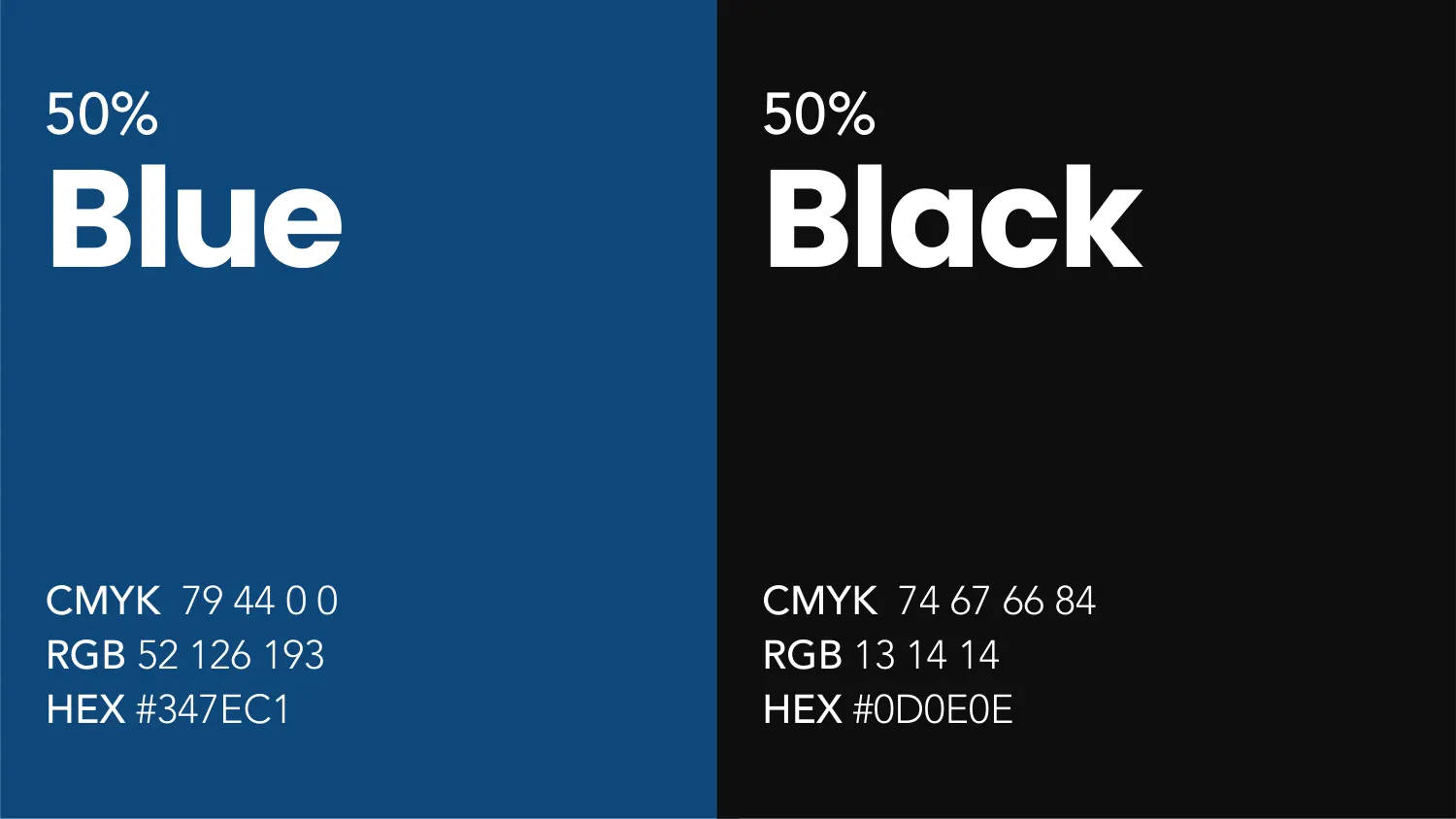
Two colours: Blue #347EC1 (CMYK 79 44 0 0, RGB 52 126 193) and Black #0D0E0E (CMYK 74 67 66 84, RGB 13 14 14). What makes the page worth the space is the number printed above each — 50% and 50% — which specifies not just what the colours are but how much of each a layout should carry.
That is the distinction between a palette and a colour system. A palette lists what is allowed; a proportion tells the next designer what the brand is supposed to look like at a distance, which is the thing that actually drifts.
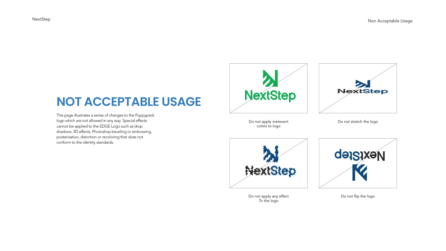
The misuse page shows the lockup broken four times, each struck through and captioned: do not apply irrelevant colours to the logo, do not stretch the logo, do not apply any effect to the logo, do not flip the logo. The accompanying note names the specific effects that are out — drop shadows, 3D, bevelling and embossing, posterisation, distortion, and any recolouring that does not conform to the standards.
Showing the failure is the point. A rule stated in prose gets read once; a stretched logo with a line through it is recognised later, by someone who never read the page.
The iconography page is not a generic set. It is play buttons, a LIVE badge, a phone and a laptop both showing a play control, a cloud with a broadcast arc, a star rating and a video scrubber — a set assembled for live video, in the single brand blue, at one weight.
The applications follow the same discipline. An email signature template with the logo, a contact block and social icons on the brand’s curved shapes, and a roadside billboard where the stepped N is enlarged until little more than the bar and a couple of chevrons are on the panel — which is the real test of a mark this geometric, and it holds.
All 36 pages are readable in full on the work page, alongside the 11 guideline documents and 47 logo projects in the rest of the portfolio. If you want a document like this one, the brand guidelines service explains what goes into it and the process page explains how a project runs — first draft in 24–36 hours.
Prefer to order through Fiverr? The same work is available on the logo and brand identity gig, where the 2,604 reviews behind the 4.9 rating are public. Briefing here is identical either way — and the copyright assignment is included on both.
Send the brief and we will come back with questions, a timeline and a quote — no charge for the conversation.
Start your project