Lusso Modular
The longest document in the portfolio, and the most rigid system in it.

Case study · 36-page document
Two ideas folded into one mark, and a palette that says how much of each colour to use.
This is a walkthrough of the delivered document, not a commissioned case study. We are not publishing a brief history, client interviews or performance figures for this project, because we do not have them. Everything described below is visible in the pages shown beside it.
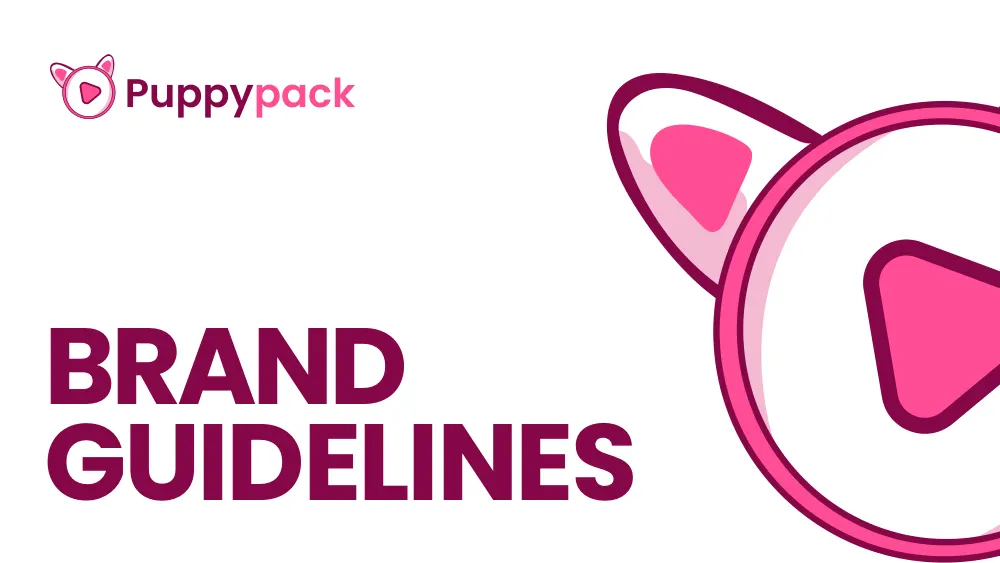
Thirty-six pages, and the whole idea of the brand is legible in the symbol alone. What follows is what the document specifies and what it shows.
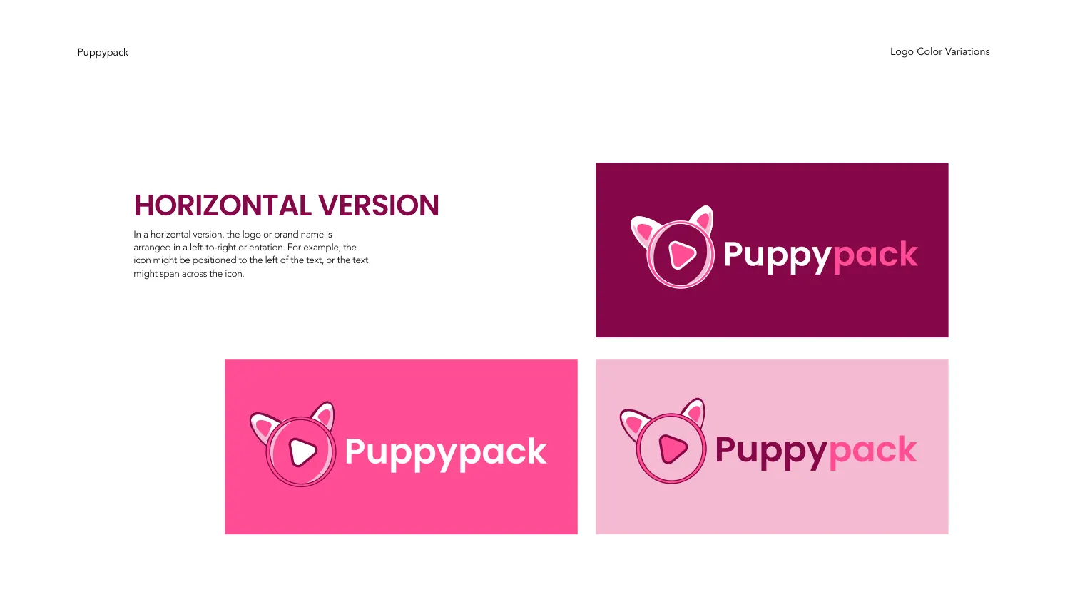
The symbol is a circle drawn as a double outline with two triangular ears rising from the top, and a rounded-corner play triangle set inside it. Both readings land at once: it is an animal head, and it is a video control. Neither is hidden behind the other, and neither needed a second element to make it work.
The ears are drawn with an inner fill offset from the outline, which is the detail that keeps them from reading as flat spikes at small size. The wordmark is two-tone — “Puppy” heavy in the deep violet-red, “pack” in the brighter pink — set in a geometric sans with generous round bowls.
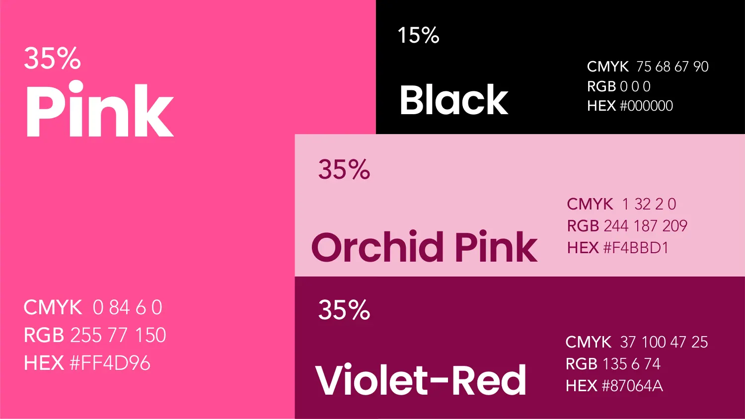
Pink #FF4D96 (CMYK 0 84 6 0, RGB 255 77 150), Orchid Pink #F4BBD1 (CMYK 1 32 2 0, RGB 244 187 209), Violet-Red #87064A (CMYK 37 100 47 25, RGB 135 6 74) and Black #000000. Each carries a percentage: 35, 35, 35 and 15.
The weighting is doing real work here. Three related pinks used in equal measure with a small amount of black is a very different brand from the same four colours used in any other ratio — and without the number, the brightest pink would win every layout by default. The page fixes the balance before anyone has to argue about it.
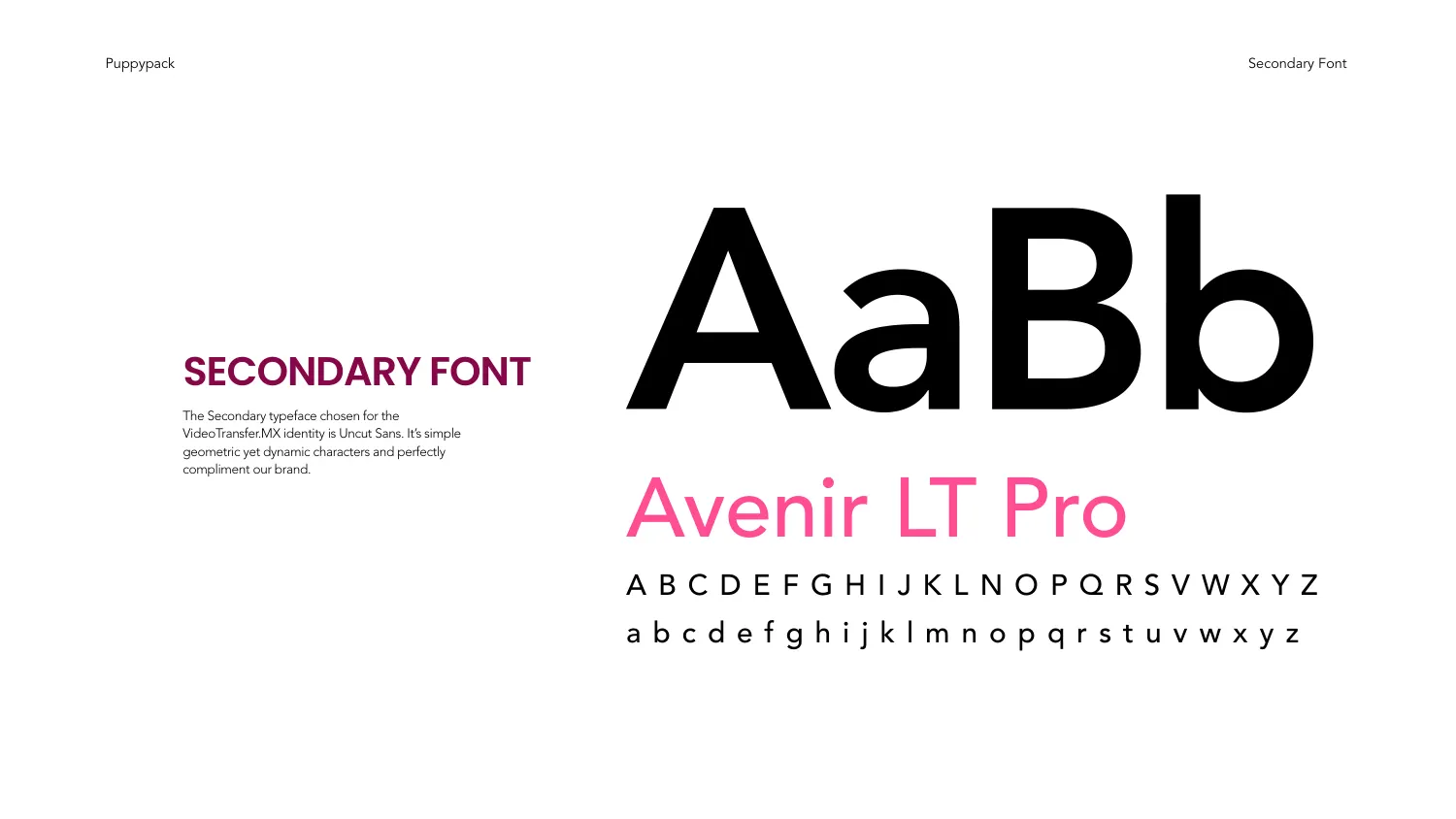
The document sets a two-face system across dedicated primary and secondary specimen pages, each showing a large Aa Bb pairing above a full uppercase and lowercase set. Avenir LT Pro is named on the secondary page. Both specimens are set on white so the letterforms are judged before the colour is applied to them.
Between sections, full-bleed dividers do the pacing — STATIONARY reversed in orchid pink out of violet-red, VISUAL IDENTITY in violet-red on pale pink. It is a small thing, but it is what stops a thirty-six page PDF reading as one undifferentiated run, and it demonstrates the palette at full size before any application does.
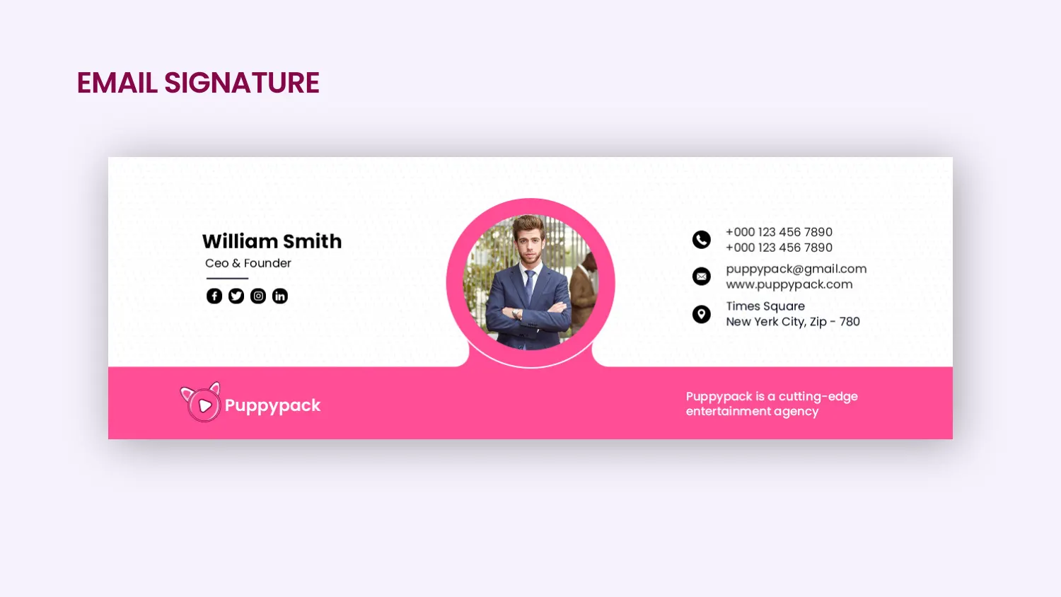
The stationery and visual identity sections carry the applications, including an email signature built as a working template — a portrait crop ringed in the brand pink, a name and role block, a full contact column, social icons, and a pink footer band carrying the logo and a one-line descriptor.
It is the least glamorous page in the document and the easiest one to leave out. Specifying the signature is the difference between a brand that is consistent everywhere and one that is consistent everywhere except the inbox.
All 36 pages are readable in full on the work page, alongside the 11 guideline documents and 47 logo projects in the rest of the portfolio. If you want a document like this one, the brand guidelines service explains what goes into it and the process page explains how a project runs — first draft in 24–36 hours.
Prefer to order through Fiverr? The same work is available on the logo and brand identity gig, where the 2,604 reviews behind the 4.9 rating are public. Briefing here is identical either way — and the copyright assignment is included on both.
Send the brief and we will come back with questions, a timeline and a quote — no charge for the conversation.
Start your project