FDV
A master brand and two sub-brands, resolved inside one document.

Case study · 40-page document
The longest document in the portfolio, and the most rigid system in it.
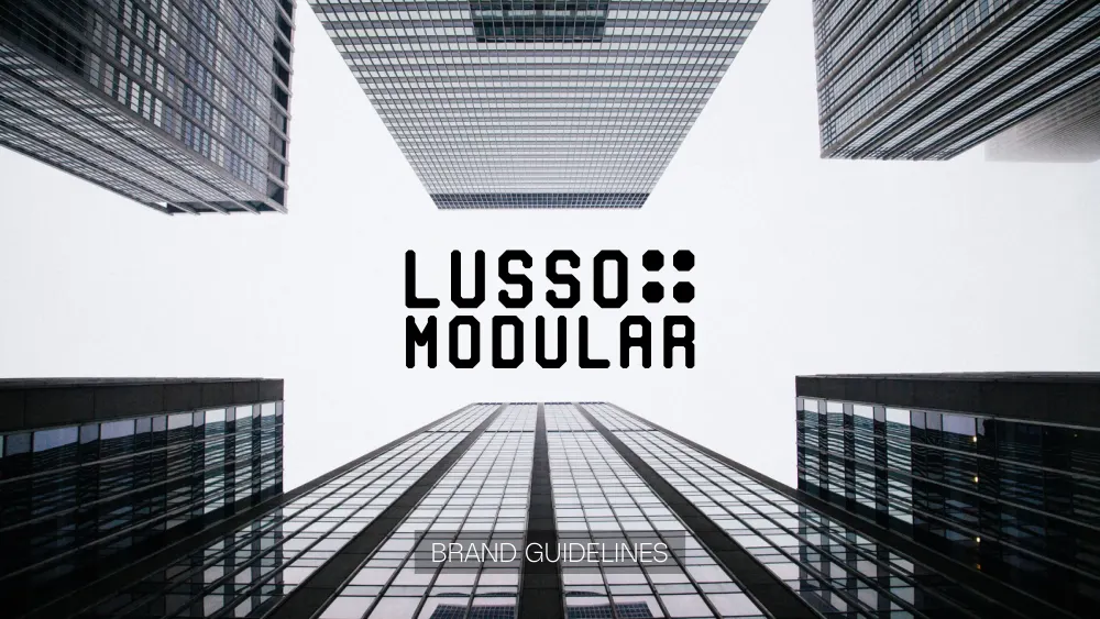
This is a walkthrough of the delivered document, not a commissioned case study. We are not publishing a brief history, client interviews or performance figures for this project, because we do not have them. Everything described below is visible in the pages shown beside it.
The contents page lists seven sections and the page each one starts on: Brand Logo, Brand Colors, Typography, Stationery design, Social Media Kit, Mockups and Images. Here is what is inside them.
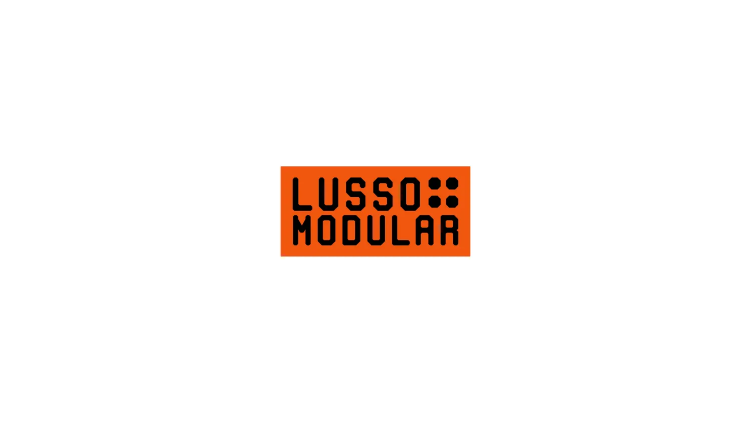
LUSSO and MODULAR sit stacked on two lines in a squared, near-monospaced face — flat-sided bowls, clipped corners on the S and the R, a stroke weight that holds through every joint. The top line is the shorter, and rather than letterspace it to match, the gap it leaves is filled with a 2×2 grid of dots. Read the two together and that grid is a module, sitting inside the name rather than beside it.
The grid also detaches, appearing as a square tile — four octagons, black on orange or orange on black — for anywhere a two-line wordmark would be unreadable. An early page fixes the scaling at 450px, 250px, 120px and 80px, so the size at which the dots stop resolving is decided here rather than by whoever places the logo.
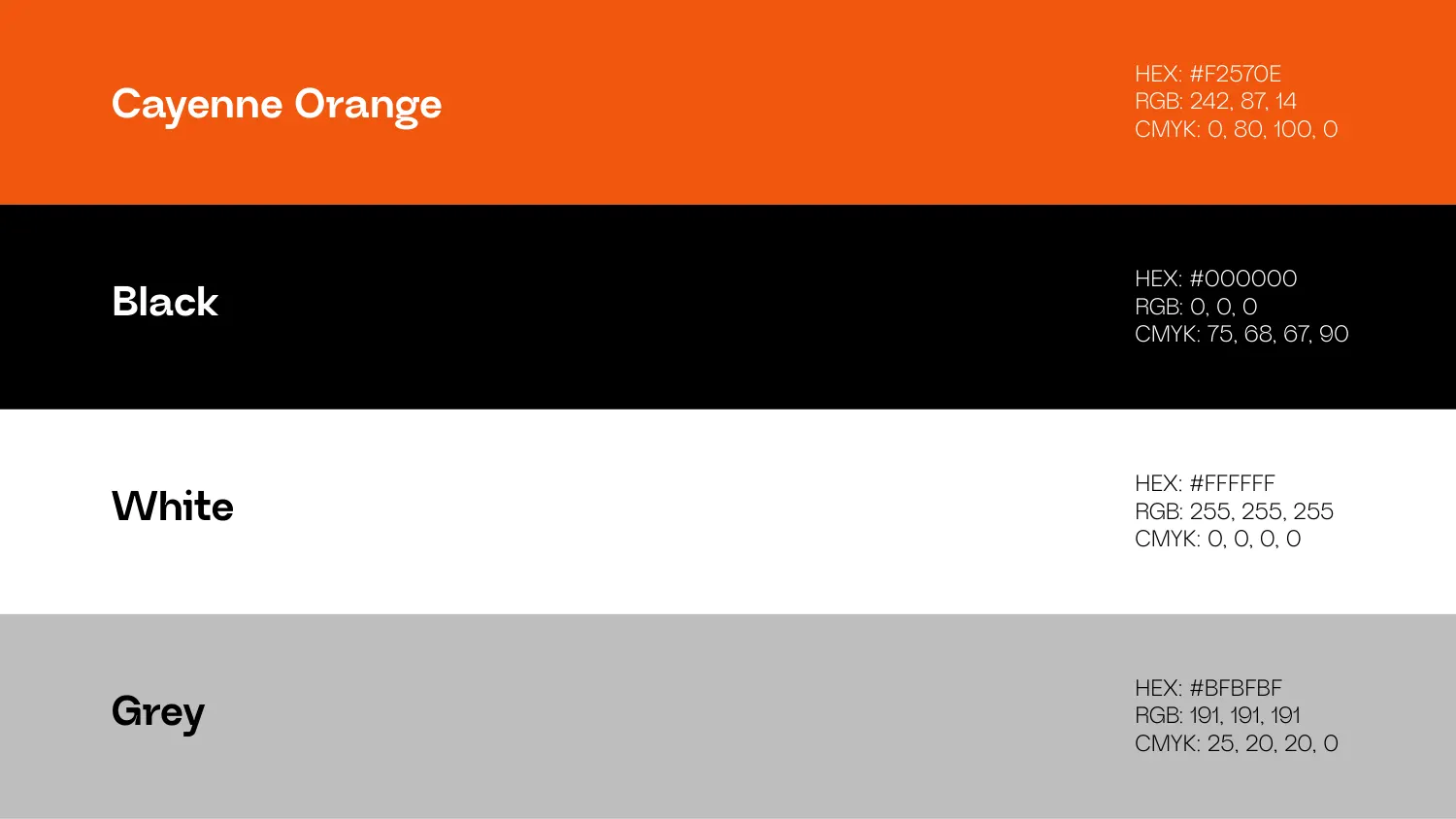
Cayenne Orange #F2570E carries the identity; Black #000000, White #FFFFFF and Grey #BFBFBF do the rest. The palette page stops at four, and not one of them is a gradient. Each swatch is given in HEX, RGB and CMYK on one line, so a printer and a developer read from the same sheet — the orange is written as CMYK 0, 80, 100, 0, a value a press can hit rather than a screen colour someone downstream approximates.
Nohemi is the primary, shown in Regular, Medium and Bold with a full character set. Neue Regrade follows as the secondary in the same three weights. Both specimens are laid out against the brand’s own backgrounds — Nohemi reversed out of black, Neue Regrade on the orange — rather than the neutral white a specimen usually gets, so the pairing is proved in the contrast it has to survive.
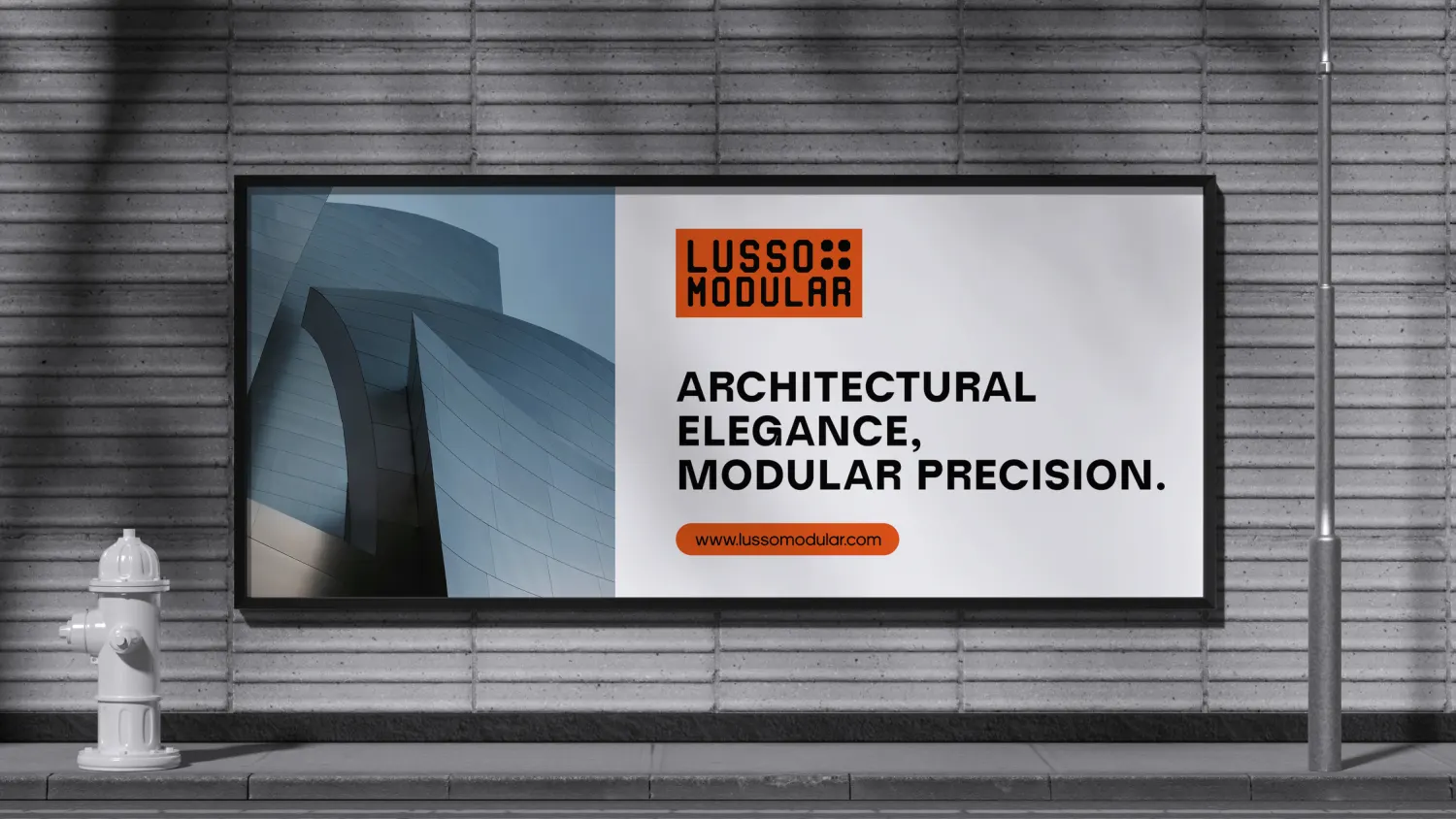
The last third of the document stops specifying and starts showing. A stationery set is photographed as one flat-lay — letterhead, business cards, envelope and folded collateral — with the module tile handling the pieces too small for the full lockup. There is a street billboard pairing the logo panel with an architectural photograph, and a social profile where the tile is cropped to a circular avatar.
Behind all of it is black-and-white architectural photography — stairwells, curtain walls, a concrete spiral — and the contents page gives Images a numbered section of its own at the back, so the photography is specified rather than left to whoever needs a picture.
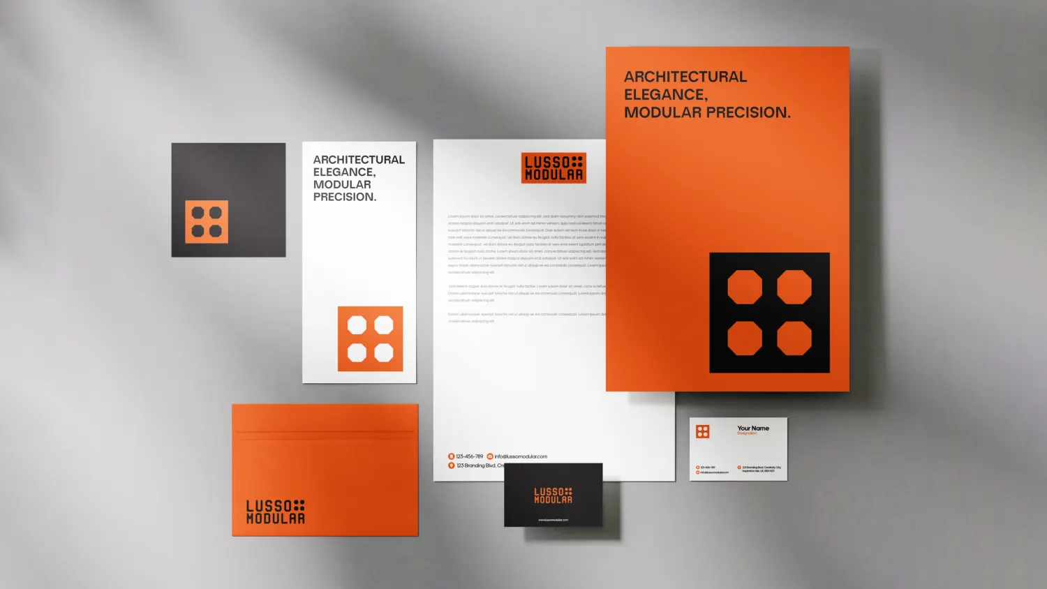
Nothing in the system is decorative. The dot grid is a module, the type is squared like the mark, and the photography is monochrome so the one accent colour never competes.
All 40 pages are readable in full on the work page, alongside the 11 guideline documents and 47 logo projects in the rest of the portfolio. If you want a document like this one, the brand guidelines service explains what goes into it and the process page explains how a project runs — first draft in 24–36 hours.
Prefer to order through Fiverr? The same work is available on the logo and brand identity gig, where the 2,604 reviews behind the 4.9 rating are public. Briefing here is identical either way — and the copyright assignment is included on both.
Send the brief and we will come back with questions, a timeline and a quote — no charge for the conversation.
Start your project