Lusso Modular
The longest document in the portfolio, and the most rigid system in it.

Case study · 22-page document
One of the few documents in the portfolio that specifies how the brand should sound, not just how it should look.
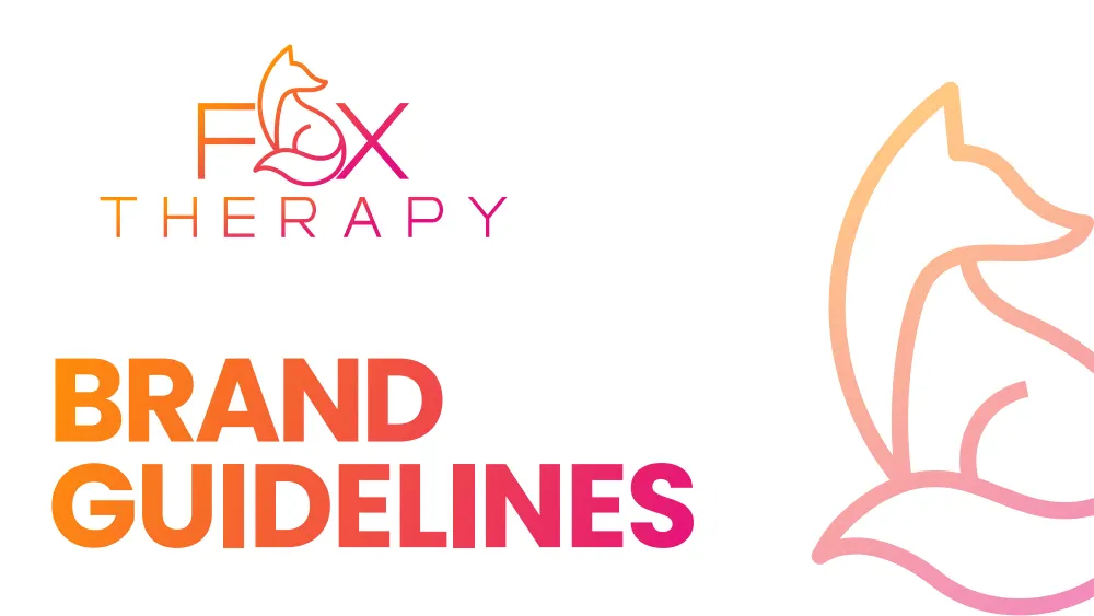
This is a walkthrough of the delivered document, not a commissioned case study. We are not publishing a brief history, client interviews or performance figures for this project, because we do not have them. Everything described below is visible in the pages shown beside it.
The contents page lists five sections and fourteen subsections. What separates this document from a visual style sheet is section 1: Brand Overview, Brand Mission, Brand Tone of Voice and Brand Personality all come before a single logo appears.
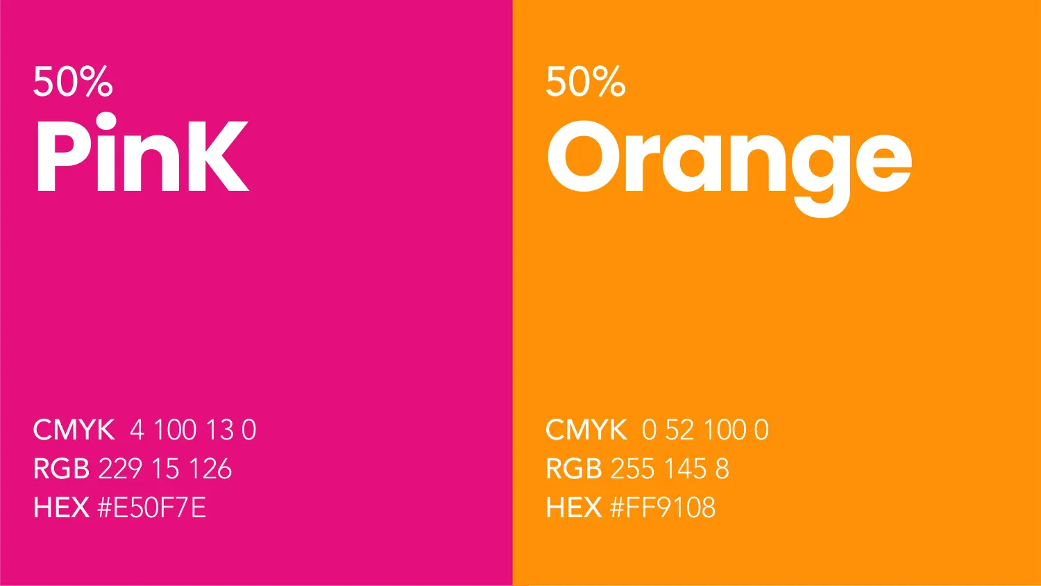
The palette is Pink #E50F7E and Orange #FF9108. Each is given as CMYK and RGB alongside the hex — the pink as CMYK 4, 100, 13, 0 and the orange as CMYK 0, 52, 100, 0. Both are then shown again at 50%, so the tint is a specified colour rather than something applied at opacity by whoever opens the file.
Giving the CMYK first matters for a brand that will be printed. A hex value tells a press nothing; 0, 52, 100, 0 is a mix an operator can actually hit. The two also run together as a gradient across the full-bleed section dividers, which is where most of the document’s energy comes from.
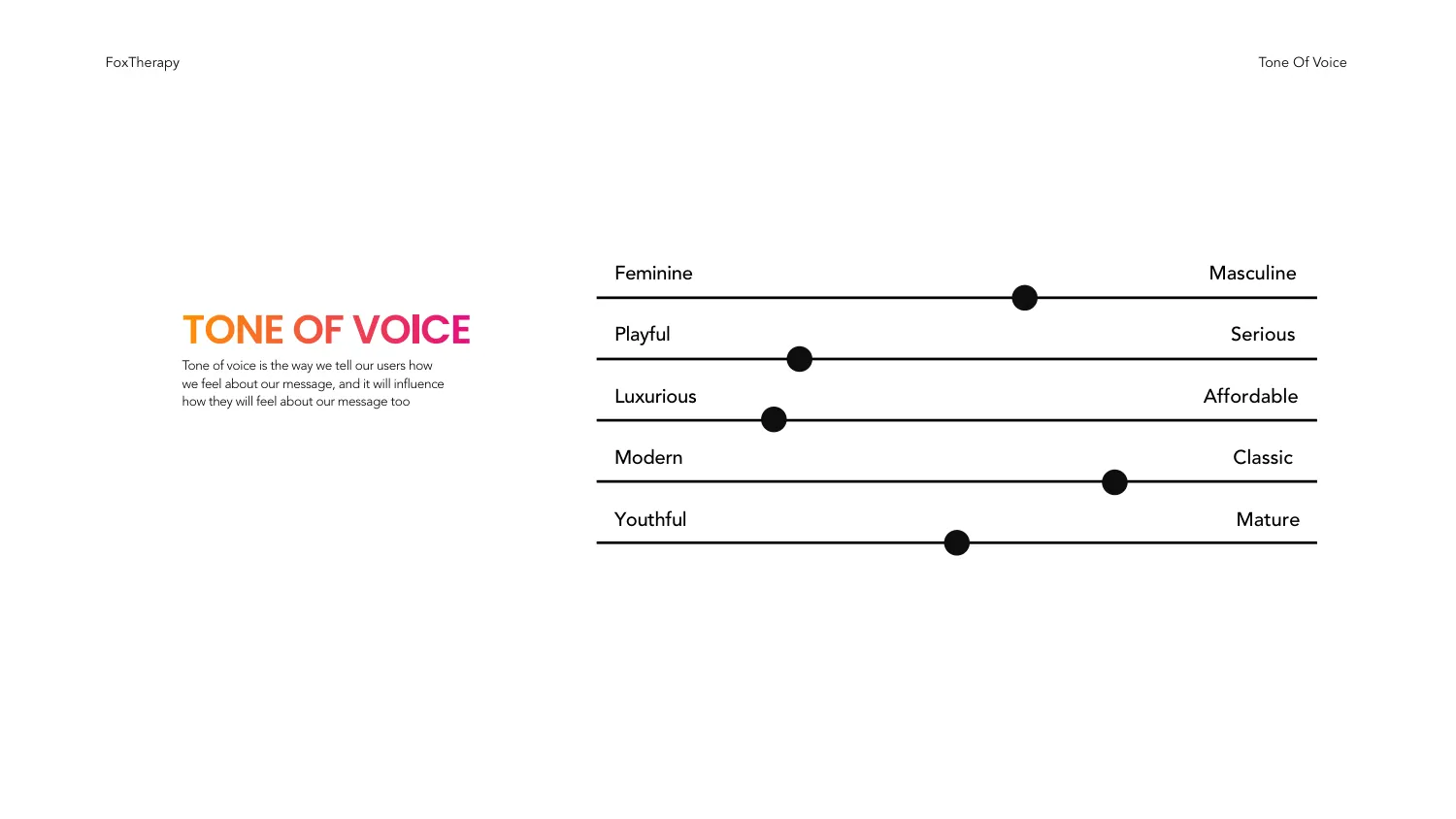
The tone-of-voice page plots the brand on five sliders: Feminine to Masculine, Playful to Serious, Luxurious to Affordable, Modern to Classic, Youthful to Mature. Each has a marker placed at a specific point rather than a paragraph of adjectives.
This is the version of a tone-of-voice section that survives contact with a real piece of copy. “Friendly but professional” cannot be argued with because it cannot be tested. A marker sitting distinctly toward Playful, and another sitting toward Luxurious rather than Affordable, gives a writer something to be measured against — and gives the client grounds to reject a draft that misses.
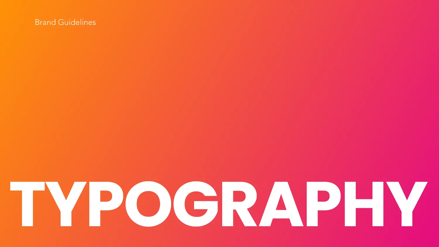
Each section opens on a full-bleed page: the pink-to-orange gradient across the whole sheet, the section name in a heavy grotesque set in white, bottom-aligned and running off both edges. There is nothing else on the page.
Reproduced at thumbnail size these dividers are still unmistakably this brand — which is the practical test of whether a two-colour gradient is doing real identity work or just decorating. The type is cropped deliberately, so the word is recognised by its shape before it is read.
All 22 pages are readable in full on the work page, alongside the 11 guideline documents and 47 logo projects in the rest of the portfolio. If you want a document like this one, the brand guidelines service explains what goes into it and the process page explains how a project runs — first draft in 24–36 hours.
Prefer to order through Fiverr? The same work is available on the logo and brand identity gig, where the 2,604 reviews behind the 4.9 rating are public. Briefing here is identical either way — and the copyright assignment is included on both.
Send the brief and we will come back with questions, a timeline and a quote — no charge for the conversation.
Start your project