Lusso Modular
The longest document in the portfolio, and the most rigid system in it.

Case study · 27-page document
A letterform doing two jobs at once, and a document strict about protecting it.
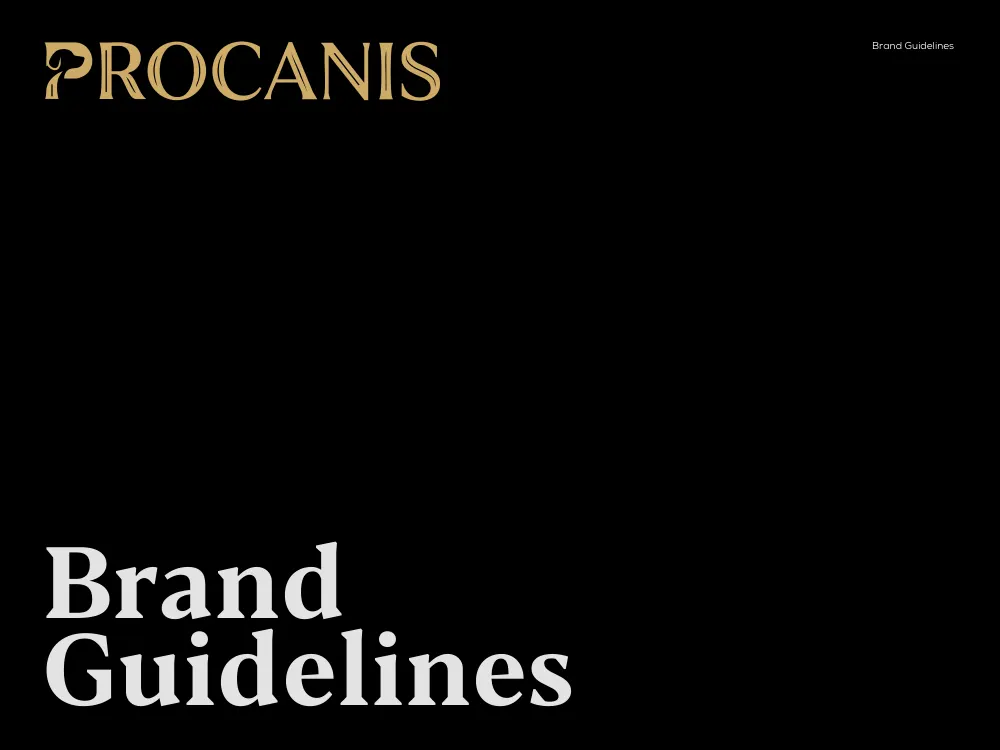
This is a walkthrough of the delivered document, not a commissioned case study. We are not publishing a brief history, client interviews or performance figures for this project, because we do not have them. Everything described below is visible in the pages shown beside it.
PROCANIS is set in a high-contrast display serif, gold on black, and the whole document is built as a two-panel spread — cream on the left carrying the rule, black on the right carrying the artwork. Here is what is inside it.
The wordmark reads PROCANIS in a flared display serif with sharp, spurred terminals and a strong thick-thin axis. The letter that does the work is the first one. The P’s bowl and stem are drawn so that the counter and the descending stroke resolve into a hound’s head in profile — a drooping ear, a muzzle, the line of the jaw. Canis is Latin for dog, and the mark says so without a single illustrative element sitting next to the name.
It is the harder version of this idea to execute. A pictorial mark placed beside a wordmark can be redrawn or dropped; a mark built into a letterform cannot be separated from the name by accident. The document then extracts that P as a standalone symbol, which is the test of whether the drawing works — and it does, because the dog is legible at symbol size where the full wordmark would not be.
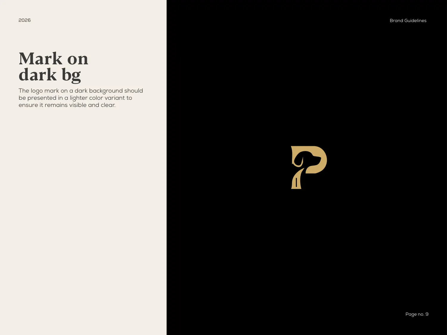
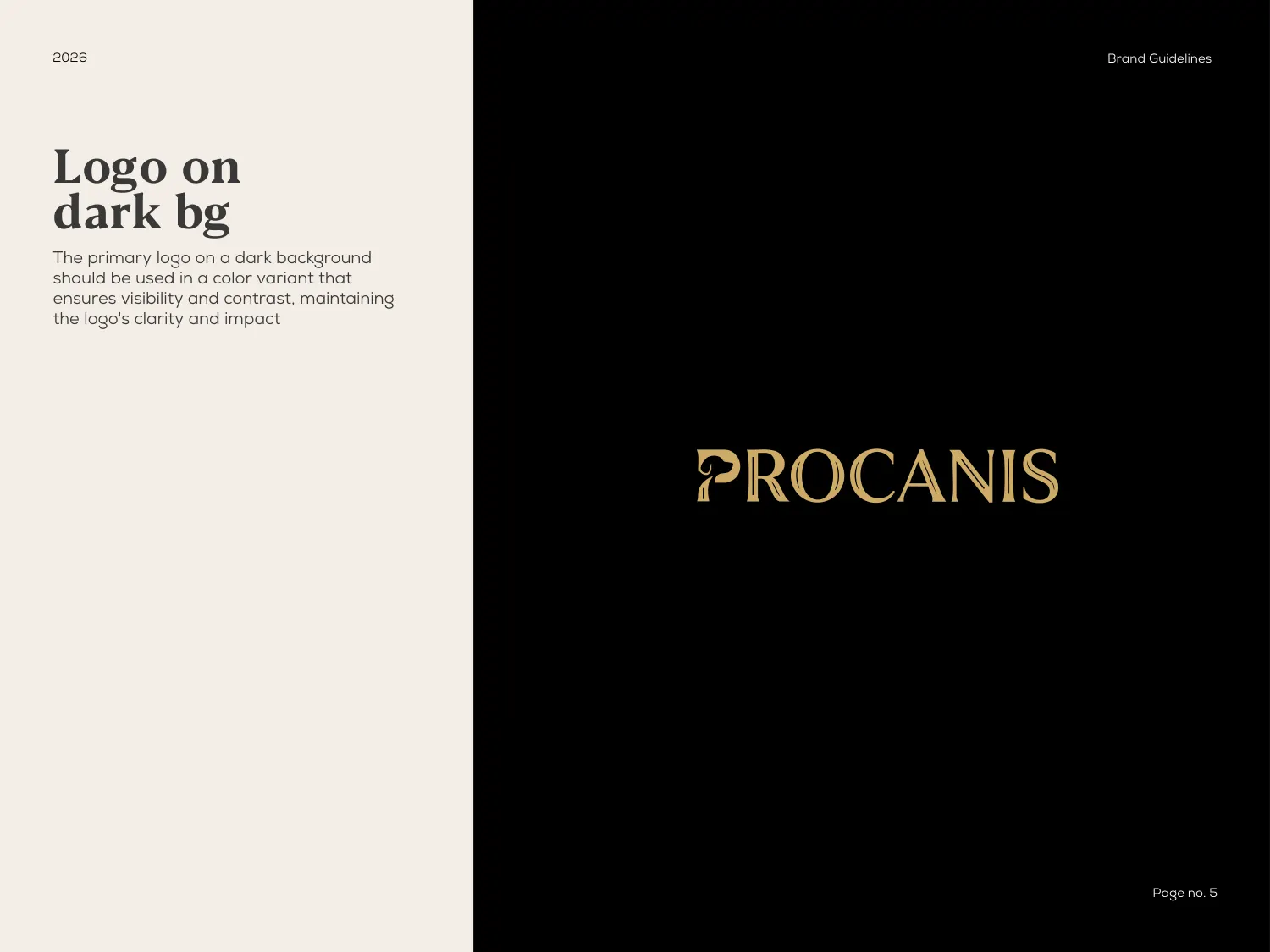
Separate pages specify the logo on light and on dark, and then repeat the exercise for the mark on its own — four specifications where many documents would give one. The instruction on each is the same in substance: on a dark background the artwork moves to a lighter variant so it holds its contrast rather than sinking into the field.
This is the kind of rule that looks obvious written down and gets broken constantly in practice, usually by someone dropping the dark-background file onto a dark photograph. Specifying it four times, once per case, is what makes it enforceable.
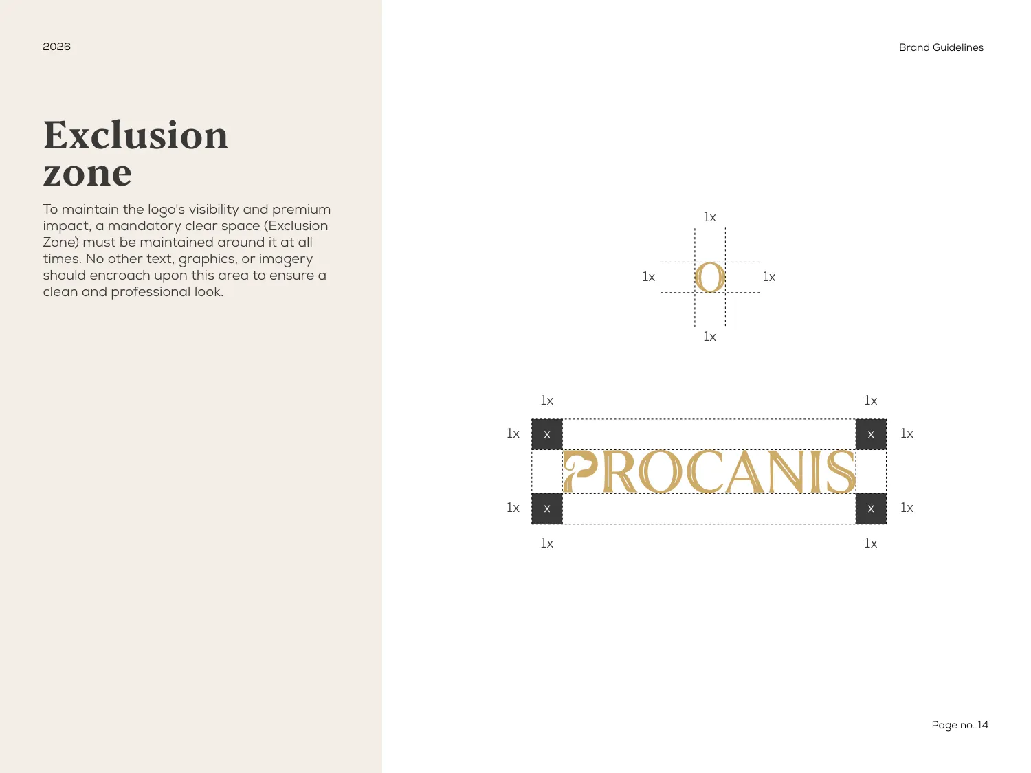
The exclusion zone page sets the mandatory clear space as 1× on all four sides — and defines that 1× as the O from the wordmark itself. Dashed guides run around the lockup with the measure marked at every edge.
Deriving the unit from the logo rather than from an absolute measurement is what makes it survive scaling. A rule written in millimetres is wrong the moment the logo is enlarged for signage; a rule written in O-widths is correct at every size, which is the entire point of writing it down.
All 27 pages are readable in full on the work page, alongside the 11 guideline documents and 47 logo projects in the rest of the portfolio. If you want a document like this one, the brand guidelines service explains what goes into it and the process page explains how a project runs — first draft in 24–36 hours.
Prefer to order through Fiverr? The same work is available on the logo and brand identity gig, where the 2,604 reviews behind the 4.9 rating are public. Briefing here is identical either way — and the copyright assignment is included on both.
Send the brief and we will come back with questions, a timeline and a quote — no charge for the conversation.
Start your project