Lusso Modular
The longest document in the portfolio, and the most rigid system in it.

Case study · 28-page document
A hairline drawing, held together by a palette that never raises its voice.
This is a walkthrough of the delivered document, not a commissioned case study. We are not publishing a brief history, client interviews or performance figures for this project, because we do not have them. Everything described below is visible in the pages shown beside it.
Twenty-eight pages, numbered in sections and folioed in an oval bottom-right. It is the most restrained document of the six, and the restraint is the system.
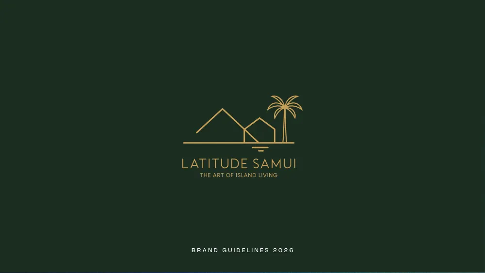
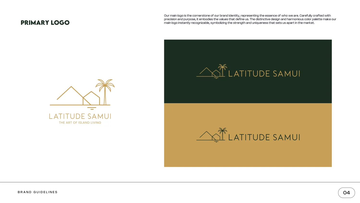
The mark is a landscape drawn in a single hairline: two pitched roof profiles overlapping at different scales, a palm tree, a horizon rule, and a small double-stroke beneath the nearer roof that reads as its reflection in water. Nothing is filled and nothing changes weight. LATITUDE SAMUI sits below in a wide-tracked light sans, with the strapline THE ART OF ISLAND LIVING set smaller beneath it.
Because the whole thing is one weight, it inverts cleanly, and the document shows it both ways — gold on dark green, and dark green on gold. A clear-space page sets an exclusion zone of 1× on all four sides, measured off the mark, with the note that no text, graphic or image may enter it.
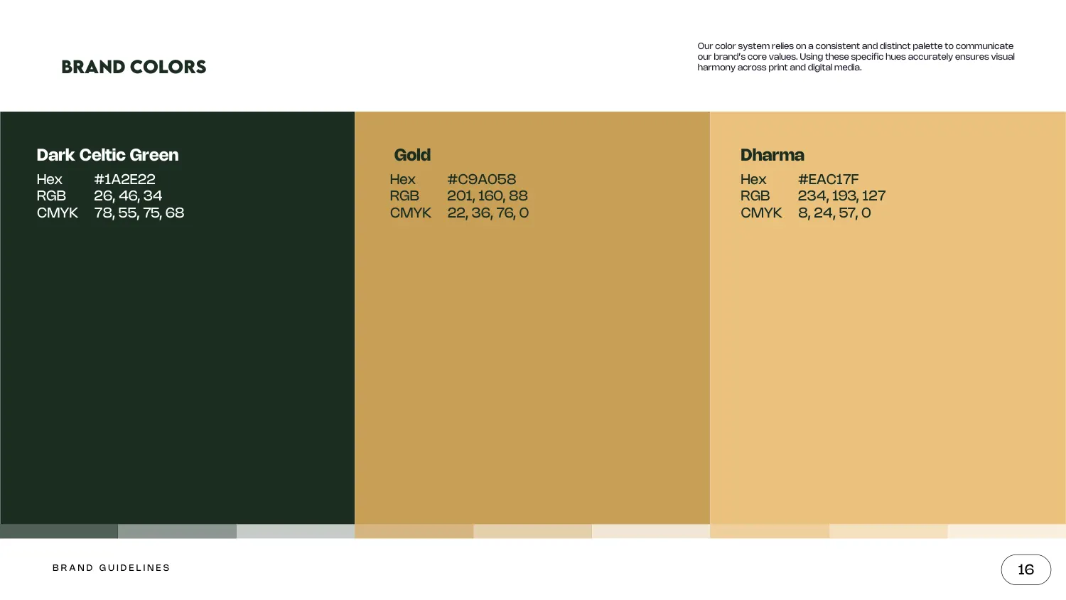
The brand colours are Dark Celtic Green #1A2E22 (RGB 26, 46, 34), Gold #C9A058 (RGB 201, 160, 88) and Dharma #EAC17F (RGB 234, 193, 127) — a near-black green and two golds a shade apart, so the palette can build depth without introducing a new hue.
A second page adds neutrals and names them: Warm Pebble #DCD5C9, Forest Ink #1C2420 and Soft Sand #F3EFE6, with the stated job of body text, interface borders and background fills. Separating brand colours from working neutrals is what stops the gold being used for paragraph text six months later.
The type page splits explicitly into a headline font and a secondary font. Lemon Milk Bold takes headlines and key statements, shown in full uppercase with numerals; Nohemi handles body copy and detail in Bold and Regular. The pairing is set out side by side on one spread with a note explaining the division of labour, rather than as two specimen pages that leave the reader to infer it.
The iconography page carries forty line icons at the same weight as the logo: apartment blocks, houses, a garage, a balcony, floor plans, SALE, RENT and SOLD boards, keys, a hard hat, surveyor’s tools, map pins and routes, a security camera, fencing, roads and parking. Drawing them at the logo’s weight is what makes them part of the identity rather than a stock set sitting next to it.
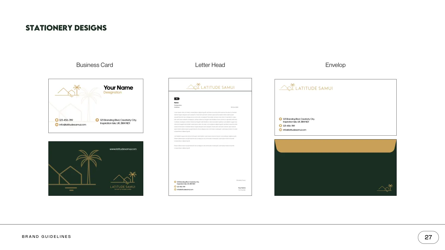
The applications are quiet and complete: a business card front and back, a letterhead with a gold-marked contact block, and an envelope in dark green with the mark small in the corner. There is a profile-picture page giving the circular crop on cream and on forest green, and a social media kit section — so the same drawing is specified from a printed envelope down to a circular avatar.
All 28 pages are readable in full on the work page, alongside the 11 guideline documents and 47 logo projects in the rest of the portfolio. If you want a document like this one, the brand guidelines service explains what goes into it and the process page explains how a project runs — first draft in 24–36 hours.
Prefer to order through Fiverr? The same work is available on the logo and brand identity gig, where the 2,604 reviews behind the 4.9 rating are public. Briefing here is identical either way — and the copyright assignment is included on both.
Send the brief and we will come back with questions, a timeline and a quote — no charge for the conversation.
Start your project