Brand guidelines
The designed PDF that tells every printer, developer and new hire exactly how the brand is used — so it stops drifting.

A logo is not a picture you approve once. It has to survive 16 pixels and a shopfront, one ink and full colour, embroidery and an app store thumbnail. That is the brief we design against.
Logo design is the work of building a mark that identifies your business and keeps identifying it under conditions you will not control — a two-ink printer, an app icon at thumbnail size, an embroidery machine with a stitch minimum, a competitor sitting two feet away on the same shelf. The drawing is the visible part. The engineering underneath it decides whether the drawing survives contact with any of that.
So we start with the situation rather than the aesthetics: what you actually sell, who you are competing with for a half-second of attention, what your name already implies before anyone draws anything, and every surface the mark physically has to appear on. Those four answers rule out more directions than they open up, which is exactly what you want a brief to do. A logo that could belong to anyone in your category is a logo you paid for in order to blend in.
Then a designer draws it. Not a generator, not a prompt tidied up afterwards — and that is a commercial point as much as a craft one, because authorship is what makes a mark protectable in the first place. What AI logo generators are actually good for goes through the ownership problem properly. Every direction that reaches you was made by a person who can tell you why the counters are that width and why the wordmark sits at that weight.
What you receive
The same kit ships on every package. What changes between tiers is how many genuinely different directions we design, never what you walk away holding at the end.
The vector sources are the load-bearing line in that list. They are the editable originals — the thing that lets any designer you hire in five years pick the brand up and keep going, instead of tracing a flattened PNG and quietly redrawing your logo slightly wrong. Studios that keep them are keeping a lever, and a great many do. Logo file formats explained covers which file belongs with whom.
Start a logo design project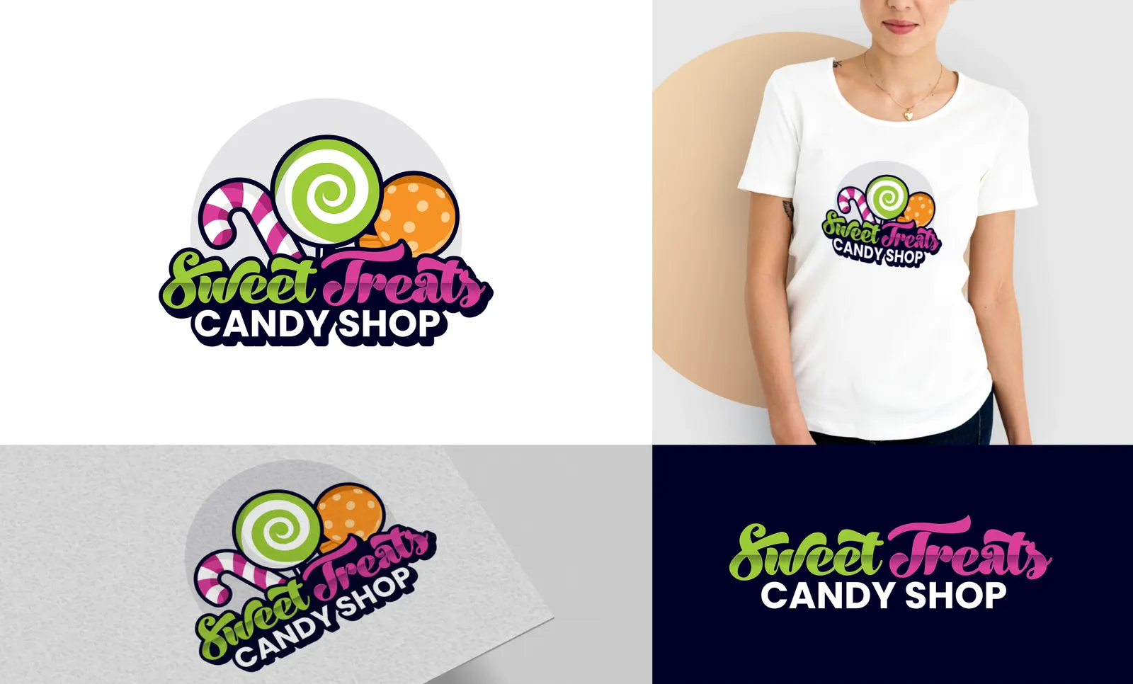
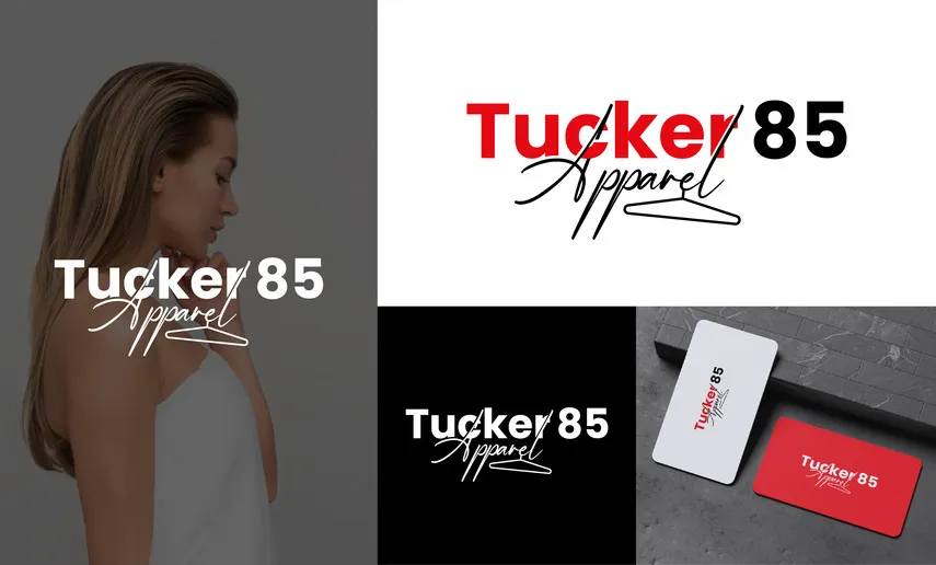
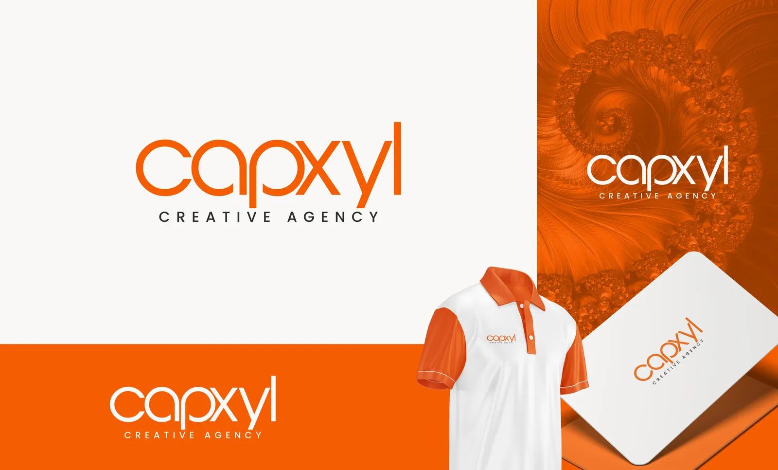
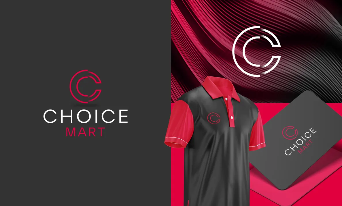
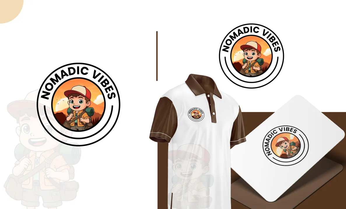
Logo types
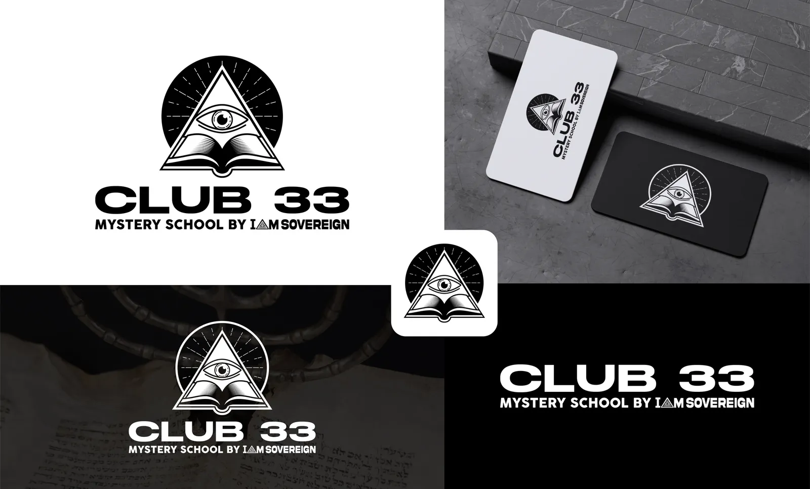
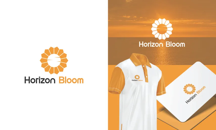
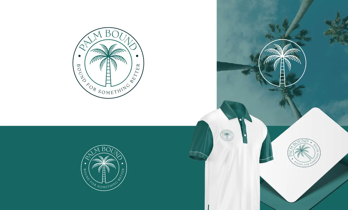
Almost every brief arrives asking simply for "a logo". There are seven structurally different kinds and choosing the wrong one is expensive later — an emblem cannot be split apart for an app icon, and a delicate wordmark cannot be embroidered small. We pick the type from your brief, then argue with ourselves about it. The seven types of logo explains what each is good at, and all seven boards are on the work page.
A symbol locked to a wordmark — the most flexible type, since the mark and the name can be used together or apart.
The name itself, drawn as the logo. Works when the name is short and worth saying out loud.
A shape that means nothing until you give it meaning. Ownable, and it never dates the way a literal icon does.
Initials built into a mark. The answer when the full name is long and keeps getting shortened anyway.
A recognisable object drawn simply. Instant to read, and it survives being shrunk to an app icon.
Type sitting inside the shape. Traditional, weighty, and the type that reads as heritage.
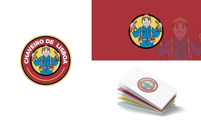
A character that can carry a brand across campaigns — illustrated, and priced separately from the standard packages.
How it runs
This is the logo-specific version. The studio-wide process, including how revisions and QA work across every discipline, is on the process page.
You answer the intake questions; we come back with the ones your answers raised. If two competitors already own the colour you asked for, this is where you find out — not at concept stage. How to write a logo design brief is the same list, free to use anywhere.
Every direction starts as twenty or thirty tiny drawings, most of them deliberately bad. Working small forces an idea to hold as a silhouette before anyone spends a day refining curves that were never going to work.
Surviving thumbnails are rebuilt in vector on a construction grid — counters, joins, stroke weights, optical corrections. It is the slowest step and it is the one that decides whether the mark still reads at favicon size.
Small-size test, one-colour test, reversed-out test, and a similarity check against the competitors you named. Why logos fail at small sizes is the test we run first, because it fails the most directions.
Concepts arrive on real applications — signage, packaging, a phone screen — with the reasoning written out beside them. You are judging a brand in the world, not a shape floating on a white square.
Unlimited, and that explicitly includes abandoning a direction and starting a new one. When you are happy, the full file kit and the signed copyright transfer go over together.
Fit
A first identity for a business that has none, a rebrand for one that has outgrown a mark made quickly and cheaply at the start, or a redraw: you like your logo but nobody ever gave you usable files. Rebuilding a trapped mark in clean vector is a common brief and a cheap one. Six signs you have outgrown your logo is the diagnostic.
You need it inside two hours; you want us to modify a mark you do not own the rights to; or what you actually need is a full identity system and a logo alone will leave you back here in three months. Say so in the brief and we will quote the right thing rather than the thing you asked for.
Scope
Stated up front, because the commonest bad surprise in design is a deliverable someone assumed was in the price.
We design a mark you can register and we screen it against the competitors you name, but filing is a legal step you or an attorney take. It is a separate process with its own fees and its own timeline, and no designer can do it for you.
We will tell you early if a name is going to be difficult to draw or easy to confuse. Choosing the name, and writing what the brand says, are separate disciplines with separate deliverables.
Each is its own service. They cost less when they follow a logo project, because we already hold your originals and there is no discovery to pay for twice — but none of them is folded in by default.
Questions
A structurally different one. A lettermark against a pictorial mark against a wordmark — three different answers to your brief, not three weights of the same idea with the colour changed. That is why the tiers are priced by concept count: each direction is designed from nothing rather than nudged from the last one. Revisions are unlimited on whichever you choose.
Yes, and that is tested before you ever see it. Every direction is checked flat black, flat white and reversed out of a dark field, because at some point a fax-quality print, an embroidery machine, a sponsor board or an engraver will each demand exactly that and none of them will accept a gradient.
Yes. What you receive is a full copyright assignment, not a licence — no cap on use, no royalty, no category restriction and no expiry. It is a signed document with your name on it rather than a line in a package description.
It is a common one. Send whatever exists, even a photograph of a sign or a business card, and we rebuild it as clean vector with the full file kit around it. The one condition is that the mark is yours to redraw; if it is not, we will say so before quoting.
Deliberately not. A studio with a house style is selling you its own taste and hoping it fits. The direction comes from your category, your audience and where the mark has to live — the only thing consistent across our work is construction quality, not appearance.
16 pixels. That is the favicon, and it is the harshest test a mark ever faces. If a direction fails it, we redraw the direction or we do not show it to you — a logo that dissolves in a browser tab is a logo you will replace inside two years.
Unlimited, and it includes telling us the whole direction is wrong and to try another. We keep going until you are genuinely happy rather than until you run out of rounds and settle. <a href="/blog/how-to-give-design-feedback/">How to give design feedback</a> is the fastest way to make that take two rounds rather than six.
Send the brief and you get questions, a timeline and a quote back. First logo draft within 24–36 hours of the brief, and no charge for the conversation.
Start your project